
10 Tips for a Fast Website

The Need for Speed
The designer is the first person to get blamed when a website is sludgy. The engineers start asking about the rounded corners, the product manager wonders about the choice of fonts, and the client starts noticing a dip in sales or retention. A designer who isn’t armed with knowledge about performance can often fall into the trap of blaming the rounded corners—they remove important design elements or engaging features, just hoping the site will get faster.
With clients demanding more video, Flash, and interaction from our websites than ever before, how do we fit in all that functionality and have a fast site that users will love? After reading the 10 tips in this article, you’ll know what matters to performance (and what doesn’t!) and be ready to design fast websites.
Speed Tip #1: Create library of smart objects
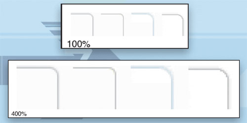
Duplication can happen in any project when we lose sight of the designs we’ve already created and add new features that are just too similar and don’t add value. The rule of thumb is that if two designs are too similar to be used on the same page, they are too similar to be used on the same site. Choose one. [Insert Image_01] CAPTION: Rounded corners from Yahoo! Personal Finance are too similar. Most users aren’t sophisticated enough to notice the subtle variation. Each rounded corner module requires additional images and CSS, which slows the page.
A library of smart objects can be used to design new pages in your website. The goal is that new designs should only be created when the existing objects are insufficient. Perhaps you’re wondering what I mean by objects? Imagine that all the different parts of your designs were like LEGO bricks that you could mix and match to create new and interesting pages. If contours, backgrounds, block headers and footers, tabs, drop shadows, and lists could all be combined in different ways, it would allow tons of flexibility in page layout and design. The library allows you to quickly find out what objects already exist, and how they were intended to be used. Rather than hunting around in multiple Photoshop and Illustrator files on different designers’ computers, a library is a one-stop-shop where you can store these building blocks as smart objects.
The library should be something like a style guide, but less formal, and the objects should be stored in such a way that we can quickly grab an existing rounded corner box, stretch it to a different height and width, and pop it into a mockup for a new page. New objects should be added to the library when the design has stabilized, and stale objects should be removed so they aren’t inadvertently used. A library can help you avoid unnecessary duplication.
Speed Tip #2: Use consistent semantic styles
When a new site is born, the style goals are usually clear. As the site evolves, things tend to get a bit muddled as more people touch the design and the client changes direction multiple times. The more consistent your styles, the leaner the code will be. Explain to developers not only what something looks like, but when and how it should be used (semantics), and the code will be much more efficient.
A Web developer might call a title “bigGrayHeading,” then a few months later, the client prefers blue. If the developer understands your intentions, she can call it “section” or “product,” which will be very clear to people building new HTML pages. Naming layers is helpful, but your thought process won’t always be obvious from the PSD. Nothing can replace good communication.
Speed Tip #3: Separate contour and background color
Photoshop naturally makes modules that are transparent on the outside. You choose fill and stroke colors, and it does the rest. On the other hand, you can achieve truly fast websites only if you separate contour from background and content. The goal is to be able to combine any contour with any background color, header, footer, image, or other content.
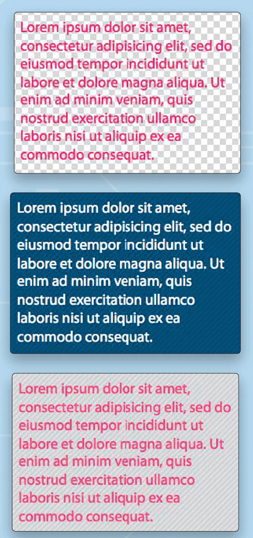
The same basic glow combined with a transparent (left), blue (middle), and gray striped (right) background. A contour that’s transparent on the inside requires careful selection of pixels and progressively enhanced PNG8 to keep the curve as smooth as possible.
The same contour can also be combined with different headers, footers, or even content and images. Because it’s transparent on the inside, the design has loads of flexibility and is very fast.

Unless you’re willing to have square corners in Internet Explorer, you can’t have a module that’s simultaneously transparent on the inside and outside. A module that’s above a variable background like an image, gradient, or text won’t be as flexible and the site may be slower.
Speed Tip #4: Optimize images and sprites
Most designers know about the Save for Web feature in Photoshop, but you may not know that you can make images even smaller using techniques that cause absolutely no loss in quality. Pixel for pixel, the image is exactly the same, except the file size is smaller. First, choose a reasonable quality via Save for Web. Next, upload images to http://smush.it, and any wasteful image bloat will be removed. Most sites can remove between 10–40% of the total weight by putting their images on a diet!
Speed Tip #5: Avoid nonstandard browser fonts
One of the main complaints I hear about designing for the Web is the lack of typographical control. You want beautiful fonts, but for the moment, the Web makes that impossible. As a workaround, designers often create headings, buttons, and other elements with the text baked into the background graphic.
This can slow the site to a crawl. Even good ideas, like combining background images into CSS sprites, can have unintended consequences when we make seemingly innocuous design decisions. Sprites grow and grow as more text and background color combinations are created. Text should be real HTML text, not images. This is one of the first things to check when a site is exceptionally slow.

Amazon sprites include text as images, a practice that makes their sprites larger.
Speed Tip #6: Avoid height alignment
Height alignment with CSS alone isn’t really viable, and still requires expensive JavaScript. Every time your script jumps through the elements on an HTML page, the site will get slower. The more times it happens, the slower it will be. Height alignment requires a lot of these jumps. Insofar as it’s possible, avoid designs that require height alignment.
Speed Tip #7: Choose your bling carefully
Every site tries to have something special—a design element or feature that sets it apart from other sites in the same space. Unfortunately, if you add too many special touches, frustrated users will only notice how slowly the site loads. Most of the design should use shared elements that are common and consistent across the entire site. Save the exceptions—the bling—for high-impact situations that really make your site stand out.
Avoid large images or Flash below the fold and in secondary tabs, few users will make it that far, particularly if your site is slow. Every time you consider adding bling to the site, ask yourself how that particular element will impact the user experience? Is it worth making the site slower?
Keep in mind that tolerance for both latency and visual decoration are often market dependent. Users don’t always distinguish Web and desktop applications, so their expectations will be higher. They may also be more or less tolerant of slow pages depending on their motivation for visiting the site, for example, PBS Kids versus Mint.com. Be aware of market constraints, and avoid one-size-fits-all bling.
Speed Tip #8: Be flexible (height and width)
Output from tools such as Photoshop is fundamentally different than webpages, and in some cases, this makes it more challenging to design for the Web. In Photoshop, you create a box, set its stroke, choose the radius of its rounded corners, and specify a height and width of, say, 393px. On the other hand, for the Web, most container objects should be height and width agnostic. Why is that?
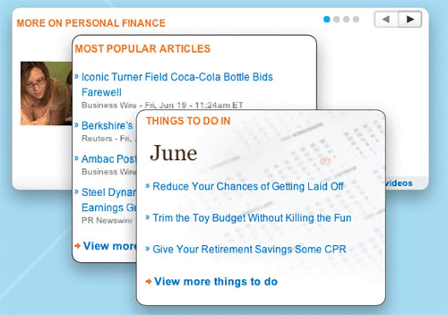 Changes in module width, background color, or background image are an excellent example of module reuse on Yahoo! Personal Finance. The module can even contain a carousel.
Setting height or width in pixels limits the ways that you can reuse an element. Reusing the same element in different ways is great for performance; the user already downloaded the images and CSS, so it’s very fast. Grids should control the width and content should control the height. That way, when you add another paragraph, the rounded corner box will grow taller to accommodate it. More about grids in the next tip.
Speed Tip #9: Learn to love grids
Website performance is all about abstracting reusable elements. Grids are a great way to do just that. Familiarize yourself with the grids used on your websites. Sometimes a few pixels larger or smaller means your element will fit an existing grid and you can avoid slowing the site with custom code.

Grids may be used to divide any area into subsections. Gutters are sometimes included.
When choosing a grids system for a new site, it can be tempting to choose fixed pixel widths, but consider using percentages as they respond better to changes in overall site width when, for example, the number of columns varies or a redesign widens the overall layout. Try the liquid grids from my Object-Oriented CSS open source project to see this effect in action (http://wiki.github.com/stubbornella/oocss).
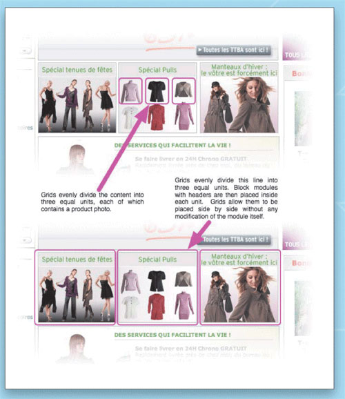
The same thirds grid divides the main column of the page and arranges the content, in this case, photos of sweaters on La Redoute. Using grids consistently throughout a design helps the page load faster as the CSS file stays lean and efficient.
Speed Tip #10: Count your suitcases
Weigh them, too. Part of figuring out how to make your websites faster is accurately assessing how bad things have become. This is easier than it might seem. There are two simple things that are responsible for most performance problems:
• Too many components is kind of like arriving at the airport with four pieces of checked luggage and three carry-ons. Each JavaScript, CSS, image, Flash, sprite, etc. counts as one component. Having around 50 components is normal, but if you want to fit more functionality into a faster page, you’ll need to bring this number down.
• Out-of-control page weight is like the traveler who arrives at the airport dragging suitcases so heavy that the baggage handler can’t even get them onto the belt. Websites that are too heavy will always be slow; keep in mind that most of our users don’t have the fancy computers and fast connections that we take for granted. Page weight is usually measured in kilobytes (which can be abbreviated KB or K). The average site is around 350K, but with the techniques in this article, you can do far better than that.
First, install Firebug (http://getfirebug.com), a free extension to Firefox. In Firebug, click on the Net tab, make sure All is selected, and scroll to the bottom. You’ll see total weight and number of components listed in the last row. Compare with industry averages or competitors’ websites to know where you stand. Dreamweaver shows file size and estimates download time, but components aren’t measured properly, so it’s best to use Firebug.
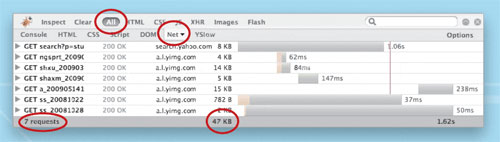
Firebug lists total components (called requests) and page weight (KB) for the Yahoo! search results page.
The designers I’ve been fortunate enough to work with have been amazing user advocates, relentlessly focused on creating a more interesting and valuable experience. After reading the 10 tips in this article, you’re ready to make lightning-fast speed and interactivity part of that user experience.

