Blueprint-Style Text in Adobe Illustrator

This blueprint technique has been seen just about everywhere—even on the cover of The Photoshop Help Desk Book by Dave Cross. This is a quick demo using a blend of live effects, filters, and even a little gradient mesh to create a seemingly complex logo treatment.
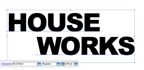
1 START WITH THE TEXT
Begin by setting your text. Select the Type tool (T) in the Toolbox and click on the artboard to set a text object. In the Control panel, set the font to Arial Black and the text size to 285 pt. Enter one or two lines of text using any word(s) you like. We have simply typed in “HOUSE WORKS” on two lines. We also typed four spaces before “WORKS” and tightened up the tracking by selecting all the text with the Type tool and pressing Option-Left Arrow (PC: Alt-Left Arrow) a few times.
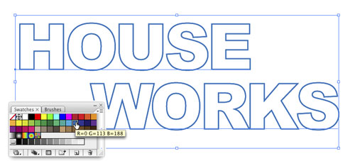
2 ADD STROKE; FILL WITH WHITE
Select all the text with the Selection tool (V). Near the bottom of the Toolbox, click on the Stroke option to make it active. Go under the Window menu and choose Swatches to open the Swatches panel. Then select the blue swatch in the Swatches panel, as shown here, to set the stroke color. Set the Stroke size to 5 pt in the Control panel. Now simply set the Fill color to white.
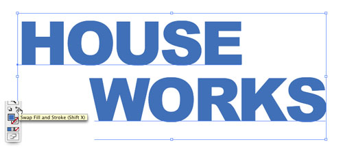
3 COPY TEXT; SWAP FILL AND STROKE
Copy this text to the clipboard by going under the Edit menu and choosing Copy. Then, go under the Edit menu again and choose Paste in Front. This will paste the copy directly over the original, so you won’t see any change. (Trust us, it’s there.) Then, swap the Fill and Stroke colors by clicking the bent double-headed arrow next to the Fill and Stroke color swatches in the Toolbox. Set the Stroke to None. All you should have is a blue fill and no stroke. Keep this object selected.
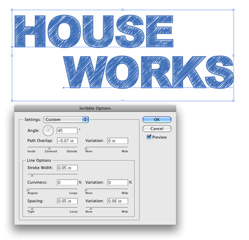
4 APPLY SCRIBBLE EFFECT
With this object still selected, go into the Effect menu, under Stylize (in the Illustrator Effects section), and choose Scribble. This is one really involved effect. At this point, you can either use the settings shown here or you can experiment to see the different results you can get. Keep an open mind—you may discover a really cool effect. Click OK when you’re done.
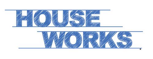
5 DRAW BLUE LINE ABOVE TEXT
Next, select the Pen tool (P) in the Toolbox and click a point just above and to the left of the text. Hold the Shift key and click a second point to the right of the text. Set the Stroke color to the same blue color we used for the text. Then in the Control panel, set the Stroke size to 7 pt. Lastly, select the line and position it right along the top edge of the top line of text.
Note: If you can’t see the stroke, make sure the Scribble effect isn’t applied to it in the Appearance panel.

6 COPY BLUE LINE THREE TIMES
Press Command-C (PC: Ctrl-C) to copy this line, and then press Command-V (PC: Ctrl-V) three times to paste it three times. Drag a copy to the bottom of the first line of text and then drag copies to the top and bottom of the next line of text (as shown here). This will give us the baselines illustrating the straightness of the letters. Offset the lines from each other so it doesn’t look too symmetrical.
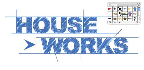
7 ADD ADDITIONIONAL LINES AND ARROW SYMBOL
Use the Pen tool to create similar blue lines along the sides of some of the letters to enhance the blueprint effect (set the Stroke to 5 points to match the stroke on the letters). Open the Symbols panel under the Window menu. In the panel’s flyout menu, go to Open Symbol Library>Arrows. Drag-and-drop the third arrow onto the artboard. With it still selected, go into the Control panel and click the Break Link button. In the Object menu, select Expand Appearance. This will turn the Symbol into a regular object. Set the Fill to the same blue we’ve been using and resize as necessary.
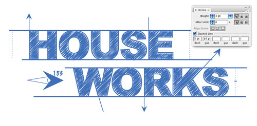
8 ADD ARROWS, DOTTED LINES, AND NUMBERS
Arbitrarily place arrows on the lines that you drew in Step 7. Just copy-and-paste numerous copies of the arrow and drag them into place. Use the Selection tool to vary the size and rotate them as necessary. Now add some small, meaningless numbers around the text to give the idea of measurements. Then add some simple, dotted lines using the settings in the Stroke panel, as shown here. We also used the Pen tool to draw an additional element to our original arrow.
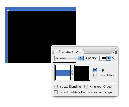
9 CREATE BLUE BOX AND MASK WITH BLACK BOX
Select the Rectangle tool in the Toolbox and draw a box over the entire graphic. Set the Fill color of this box to—you guessed it—blue. Now draw another box right over this blue one that’s slightly inset and set the Fill color of this box to black (make sure the fill is R:0, G:0, B:0 or C:0, M:0, Y:0, K:100). So you should have a black box on top of a slightly larger blue box. Select both boxes and open the Transparency panel under the Window menu. In the panel’s flyout menu, choose Make Opacity Mask. The black box will mask away the blue box.
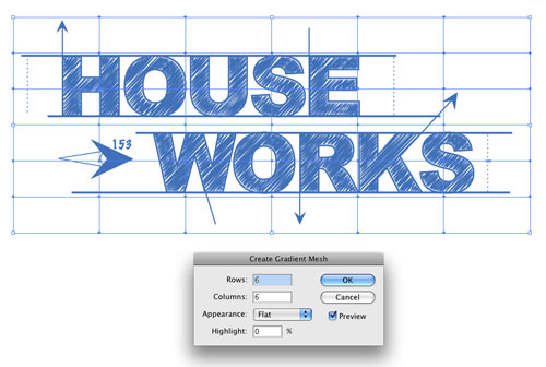
10 ADD GRADIENT MESH TO MASK
We need to do a little more work on the mask, so make sure that the mask thumbnail is highlighted in the Transparency panel (indicated by a thick, black line). Select the mask shape and go under the Object menu and select Create Gradient Mesh. Enter 6 for Rows and 6 for Columns. Set the Appearance to Flat and Highlight to 0%. Click OK. (Did you know that you could have a gradient mesh mask?)
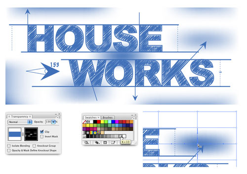
11 CHANGE POINTS ON THE GRID TO WHITE OR GRAY
Using the Direct Selection tool (A), select various points of the mesh and set their colors to white or any varying shade of gray to allow all or some of the blue to come through. The mask works similar to that of a layer mask in Photoshop where black will completely mask a shape, white reveals everything, and gray will show some transparency. The goal here is to give the effect of the blue powder on a blueprint. Note: Make sure the Fill is active in the Toolbox.
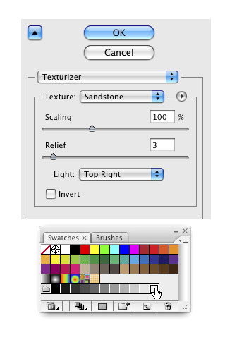
12 ADD TEXTURE
The last thing is the texture. Use the Rectangle tool to draw another box approximately the same size as the mesh (make sure you’re back in art mode and not mask mode in the Transparency panel). Set the Fill color to an off-white like this one shown in the Swatches panel. Go under the Effect menu, under Photoshop Effects, and choose Texture>Texturizer. Set the Texture to Sandstone, the Scaling to 100%, and the Relief to 3. For the Light direction, choose Top Right. Click OK. Then go under the Object menu, under Arrange, and choose Send to Back. This will finish the effect of blueprint paper.
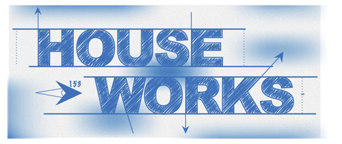
Final Image