Imitating A Scanner Darkly in Adobe Illustrator
Using Illustrator’s pencil tool and shapes of solid color, you can imitate the graphic novel styling of A Scanner Darkly. An animator from the film shows us how.
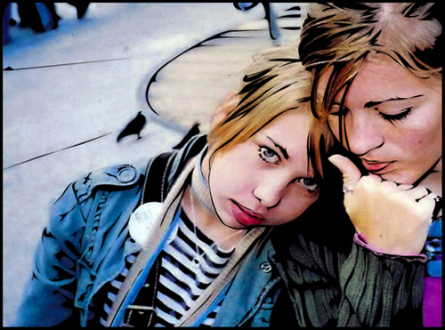
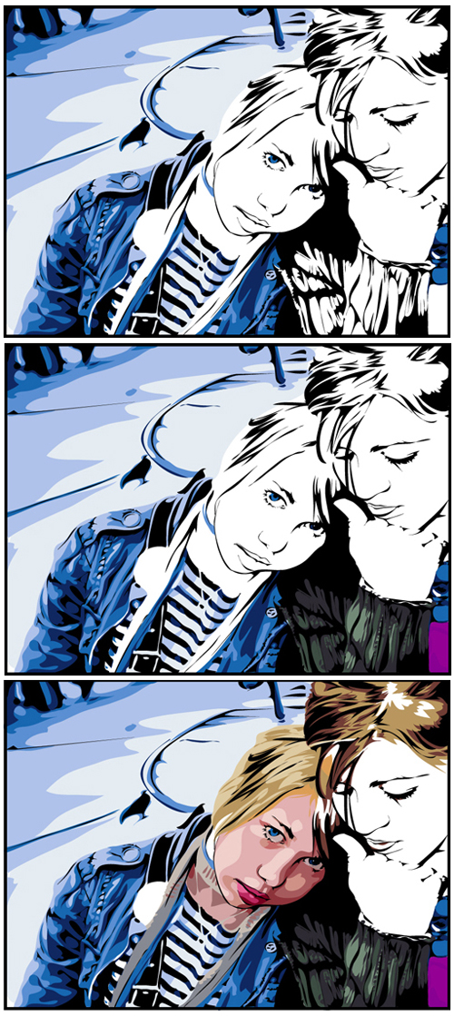
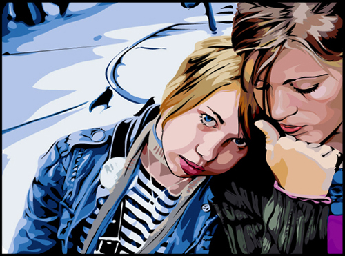
Director Richard Linklater’s A Scanner Darkly impressed audiences this summer with a stunning 2D animation style that mixes heavy blacks lines with shapes of solid color to represent a realistic image. After filming the movie live action, we used proprietary vector software to animate directly over live footage, preserving the likeness and performances of the actors – a process called “Interpolated Rotoscoping.” This tutorial will show you how I was able to recreate a similar effect using tools in Adobe llustrator. Using Illustrator’s pencil tool and shapes of solid color, you can imitate the graphic novel styling of A Scanner Darkly.
1
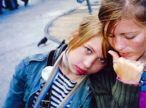
Select an interesting image for photo reference – the bigger the dimensions of the image the better. Go to File>Place to insert it into your Illustrator file.

2
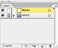
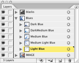
Since you’ll be drawing right over the top of this reference image and you want it to remain untouched, you’ll need to lock it on its own layer. In the Layers palette, double-click the layer and name this layer Image. Create a new layer to draw on by clicking on the Add New Layer icon at the bottom of the Layers palette and call it Blacks.

3
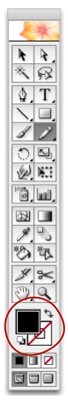
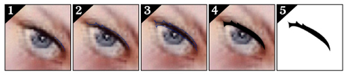
Press N or use the mouse to select the Pencil tool, and check that the Fill color is black and the Stroke color is None. You won’t be using the stroke color because you don’t want the line to have a boring static width. Instead, let’s can manually produce a thick-to-thin brushstroke effect by automatically filling in the region between two arcs drawn with the pencil tool.

4
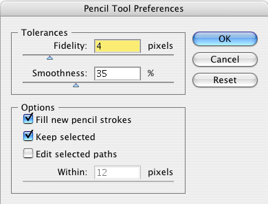
Double-click on the pencil tool and change the settings to those shown here (Fidelity to 4 pixels, Smoothness to 35%, and check both Fill New Pencil Strokes and Keep Selected). You may prefer to adjust these later on depending on the kind of result you want, but these settings are good for making a smooth descriptive line.

5
You’re now ready to begin drawing. Similar to inking a graphic novel, start by drawing thin black outlines around major forms and fill in the darkest regions. Remember to be expressive with calligraphic shapes that yield a more dynamic result. If you need more control, you can switch to the Pen tool and draw exact curves or straight lines; however, this can become time consuming. I prefer to draw quickly with the Pencil tool and then manipulate the results afterwards by using the Direct Selection tool to refine the shape and the Pen tool to add more lines. The Pencil tool, unlike the Pen, tool does not apply Fill or Stroke until you release the mouse, which is a particular advantage since it often hides edges you need to trace as you draw them. Toggle the Eye icon on your Layers palette to hide the Image layer to check your results as you go. If you release the mouse before you completely circumnavigate the shape you are tracing, you can simply draw another shape that completes the shape. Or if it is completely wrong, you can press Command-Z (PC: Control-Z) to undo that last action and redraw it. If your line is jagged or rough, you can use the pen tool to delete extra points to smooth out the shape. Deselect the shapes after you’re satisfied with them by pressing Command-Shift-A (PC: Control-Shift-A).

6
Once you have finished with “inking” the blacks, you’re ready to begin painting in the color. I prefer to work from dark to light. Create a new layer underneath the Blacks layer and call it Dark Blue. Each color will have its own layer and be divided into four to five tones, each with its own sublayer. Press I or use the mouse to choose the Eyedropper tool and select the appropriate colors right from the photo. Drag the color from the Toolbar into the Swatches palette (Window>Swatches). When you’re satisfied with your color range, double-click each color individually in the Swatches palette to set the swatch options and check the Global box. This will make it easy later on to optionally replace all instances of that color by simply adjusting the swatches. Make sure you are on the right layer and press N or use your mouse to switch back to the Pencil tool. Just like you did for the blacks, color over the reference image with the dark blue shapes. Finish all of the dark blue shapes before moving on.

7
Now that you have finished all the dark blue, create a new layer and select the next darkest tone from the Swatches palette. Repeat the process of drawing over the reference image to fill in each new color. Toggle the Eye icon on your Layers palette to hide the Image layer and check your progress.
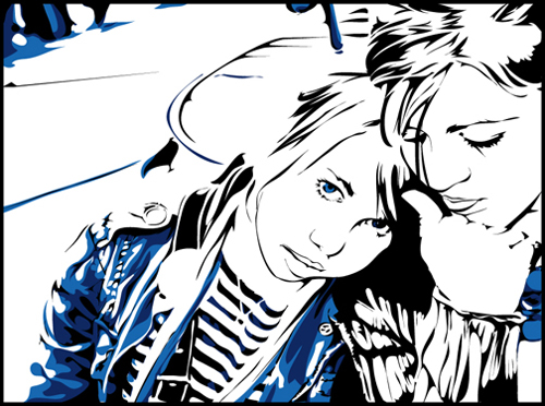
8
It’s important to stay organized with your layers because there will be lots of shapes and colors to keep track of by the end. If you don’t stay organized, it can become a huge headache to refine the shapes later on. The Blacks layer should remain on top at all times, and each new group of colors they should go underneath the previously finished ones. That way you are always filling in behind what you’ve previously finished.

9
Try to describe accurately the forms with your shapes, and don’t be afraid to play around with colors until they mesh well. Some parts of the picture, such as people’s faces, will require emphasis and greater detail. You will probably have to add a few additional colors to increase depth and to draw attention to those regions.

10
Once the whole image is filled in, turn off the Image layer and clean up the illustration. I usually create a correction layer on the bottom that can be used to quickly fill in the gaps and a layer on top to cover over any ugly spurs in the shapes. Then unlock the Image layer and drag your reference image to the side to compare it with your drawing. Continue to manipulate the image until you are happy with the results.

I expect to spend four to five hours on an image this complex. You can reduce the time you spend by limiting your colors and detail. Good luck experimenting with this new technique!
Check out the second issue of Adobe Illustrator Techniques newsletter for an interview with the lead animator of A Scanner Darkly, Sterling Allen, on vector art and inspiration.
Visitor Comments »
Comment by filipino | July 24, 2008 @ 9:06 am
” fucking great ”
.. Exactly
Comment by WizGuy | July 27, 2008 @ 4:58 am
Very good tutorial, hope to see more of this kind!
Comment by circassia | July 27, 2008 @ 11:57 am
amazing results, but it looks like it takes alot of time and talent. I have plenty of time, but no talent. =D
Comment by chee | July 29, 2008 @ 11:29 am
I have seen this tutorial before and have tried to follow it. My results are nothing like this, but I am still pleased and it’s better than I could draw freehand. I suppose practice makes perfect. I have zero artistic talent so that’s not going to help
![]()
Comment by Paul | July 30, 2008 @ 4:31 am
its so good! I tried, its beautiful, but i can not acheive it~~I should buy a bamboo
Comment by as | August 3, 2008 @ 4:29 pm
its goood but im dont know how to draw
Comment by halloww | August 5, 2008 @ 11:53 pm
perfectttt
Comment by serdal | August 8, 2008 @ 3:25 am
It’s good’ I love it…….
Comment by prem | August 12, 2008 @ 12:48 am
This is brill! Just can’t get the skin right!!!!
Comment by Suchy | August 12, 2008 @ 9:44 am
it is great tool
Comment by nemo | August 13, 2008 @ 9:17 am
Really food. But im having problems getting the skin right!!
Comment by Suchy | August 14, 2008 @ 11:16 am
Ha….I mean good, not food!!! I must be hungry!! Lol!!
Comment by Suchy | August 14, 2008 @ 11:16 am
Love this tutorial!
I need lots of practice tho…lol
Comment by Angela | August 24, 2008 @ 10:28 pm
I like this tutorial, great.
I’m always use photoshop, and newbie in Illustrator. And my biggest problem is I can’t draw, even I looked at the original bitmap image.
Comment by MbahDewo | August 26, 2008 @ 10:30 am
Scanner darkly is a movie, and if they are doing like this, i cant imagine how long they’d do it
Comment by rocker | August 28, 2008 @ 12:07 am
great tutorial I’d try this in illustrator cs3 and I did it a little bit well.
Comment by amateur | September 2, 2008 @ 10:15 pm
great, i’m inspired to do my next project like that…i have to do a self portrait using illustrator
Comment by kris | September 5, 2008 @ 1:00 am
If you apply the cutout filter in photoshop to a copy of your picture you can get a good idea of how to do the skin tones. kinda cheating but it works for me. you can even trace it if you want. this looks much better than the standard photoshop filters though
Comment by Eric | September 7, 2008 @ 5:30 pm
I feel obliged to notify your company that your internet tutorials are being used by a graphic design school on the Gold Coast. They have cut and pasted full tutorials and given it to the students as their own.
Comment by Diane | September 12, 2008 @ 7:35 am
Seeing what every body is saying about this new tutorial I ought to try it. Don’t know what my result will be.
Comment by Ruberm | September 12, 2008 @ 8:15 pm
Do you know any technique for doing print add or creating logos in Illustrator. If you do please send some techniques or tutorials thanks a million
Ruberm
Comment by Ruben | September 12, 2008 @ 8:17 pm
awesome but em having problem.
![]()
Comment by DS | September 13, 2008 @ 6:51 am
good..!!
let me try this in illustrator cs2.
Comment by MorRock's | September 14, 2008 @ 11:29 pm
good..!!
let me try this in illustrator cs2.
Comment by MorRock's | September 14, 2008 @ 11:29 pm
Really Geat
Comment by rk | September 16, 2008 @ 3:16 am
great fun with a tablet
Comment by Lulu | September 18, 2008 @ 7:52 am
A really, really beautiful piece. The software is powerful, but you don’t have to look any further than the comments to realize that fantastic pieces like this take an artist. Software will only get you so far without ability. Great work!
Comment by Ryan | September 18, 2008 @ 10:45 am
diane, nobody likes a rat!
Comment by nik | September 18, 2008 @ 11:14 am
Really good idea! I made my portrait, but it doesn’t look so good. Maybe the model is not good!
Great job
Comment by Perla | September 20, 2008 @ 3:09 pm
This is a great tutorial, but nothing new. This type of image is the reason I got a vector program in the first place, I used to use Paint Shop Pro for all my graphic design stuff, but then when I was in high school and Adobe came out with Illustrator, I switched over to Photoshop as well. I wouldnt give credit to A Scanner Darkly for this… but great detailed tutorial, good idea to seperate layers by colour. I have a bad habit of only using a couple layers with anything I do, and end up cutting to a new layer to fix whatever problem I have.
Comment by M | September 22, 2008 @ 4:07 pm
gives me a boner
hell yea….
Comment by skeeter | September 24, 2008 @ 9:46 am
Nice tutorial. I liked the idea of maintaining a separate layer for each colour. THanks a lot.
Comment by Sneha | September 30, 2008 @ 2:22 am
I fucking love you guys…
Comment by Maciek Alexander Budzinski | September 30, 2008 @ 9:43 pm
isn’t it basically tracing (+/-)?
Comment by mel | October 1, 2008 @ 3:15 pm
Incredibly time consuming, but sometimes doing it all by hand is the only way to get decent results. AI CS3’s LiveTrace will not give results like this, by the way
Comment by Brandon | October 15, 2008 @ 1:35 pm
Hi! This is beautiful work….I need some help. I have to create a self portrait using illustrator and photoshop. I have NO idea where to start. My prof said be creative and I always think in the “perfection” mode and I try to keep my mind “in the box” rather than out. HELP! What should I do and how should I do it? lol….
Comment by Jen | October 27, 2008 @ 9:21 pm
which programme did u do this
Comment by Joker | November 2, 2008 @ 11:26 am
sorry i didnt read it .) im gonna try ths thnx
Comment by Joker | November 2, 2008 @ 11:27 am
great work!!!!!!!!!!!!!!!!!!!!!!
Comment by rajasekaran | November 5, 2008 @ 7:21 am
Doing it that way works, but I think you can speed the process by a lot using Color Range. I haven’t tried it but from my experience I’m pretty sure it would work and save a lot of time.
Comment by JDK | November 14, 2008 @ 4:36 pm
fuck! that’s fucking awesome!! damn, i need some teach me how to using on XP. does everyone know how to use on XP please help me, i’ll leave my email on this. ninja1990@hotmail.co.uk
Comment by frazzzzzz | November 21, 2008 @ 5:38 am
duuude thiz is all like hella trippy man… i luuuv thiz bro… i cant wait to like… make a pic look like this dude
Comment by joe | December 5, 2008 @ 1:14 pm
I am getting onto this asap. This is really SUPERB !! Thank you for sharing this……..
Comment by Clayto TOMATO | December 8, 2008 @ 12:03 pm
hahah fucking greatschools use htis site funny
Comment by black magic | December 8, 2008 @ 1:38 pm
Joe suckss
Comment by Coach Kruger | December 8, 2008 @ 1:40 pm
This is so Beastmode ima try this but it aint gonna come out like this but ima try anyways mayne.
Comment by Icemayne | December 8, 2008 @ 1:40 pm
Looks fantastic. Good work on the movie, too
Comment by M | December 12, 2008 @ 6:41 pm
[...] A collection of tutorials for the whole Adobe family of products, including such complex tutorials as how to achieve “A Scanner Darkly”’s look. [...]
Pingback by What I read 12/18/2008 | December 18, 2008 @ 8:30 am
[...] Imitating A Scanner Darkly Tutorial from Layers Magazine (Illustrator) [...]
Pingback by Moue Magazine »10 Photo Based Illustrator Tutorials | December 21, 2008 @ 4:51 pm
[...] you want to change your picture to this type of designing work follow this link http://www.layersmagazine.com/imitating-a-scanner-darkly.html and try it in Adobe Illustrator.You can design your own picture and it can be used has profile [...]
Pingback by Scanner Darkly !!! | December 29, 2008 @ 9:08 pm
What’s the point? I mean am I dis stupa or whaaat? Are you hugh?
Comment by Bill Frederickson | January 3, 2009 @ 9:30 pm
dis is so F.en hard to do!!! but it looks ight…
Comment by li'bri | January 8, 2009 @ 2:06 pm
dis is so F.en hard to do!!! but it looks ight…
Comment by li'bri | January 8, 2009 @ 2:06 pm
thats not how it was done for the movie..if they did it this way it would take forever. way to trace though.
Comment by bob loblaw | February 4, 2009 @ 2:07 pm
Fantastic …. I’m gonna try it …
Comment by Permana Jayanta | February 5, 2009 @ 7:41 am
Although live trace will not give a result quite like this, it does provide with a quick set up. Place the image, live trace it with 16 colors, expand it, ungroup it, and then select each individual color and simplify the shapes (object>path>simplify). Way faster than manually tracing it, and the pretty close to the same result. The only things missing from there are the very dark smooth traces along the outline of the faces and expressions
Comment by Jav | February 7, 2009 @ 1:16 am
Live trace is a good feature but inferior to this technique. The problem is that everyone and their sister knows how to press the two buttons it takes to vector trace a photo. That effect can be customized to some extent but this technique (+ my intuos tablet) gives the artist more freedom to manipulate and control the elements in the illustration. It also allows the image to be built from the ground up instead of deconstructing a mess of sloppy vectors that illustrator has thrown together.
Comment by Jesse James | February 17, 2009 @ 12:58 pm
Holy shit this guy makes it sound easy but its time consuming!
imagine doing this to a movie! Frame by frame? No way!
How many “A Scanner Darkly” animators does it take to change a light bulb?
None! They are too busy animating.
Comment by Jeff | February 18, 2009 @ 9:37 am
[...] [Link] <- Site [...]
Pingback by Vector Art Designs & Tutorials | SherifAbdou - The Design Blog | February 18, 2009 @ 1:29 pm
I notice you give Linklater a mention at the top but you really need to mention Bob Sabistan. He was the one to take this style and make it popular again. Linklater piggbacked onto Sabistan later and because he has “the name” he gets the credit. Sabistan invented the process of rotoscoping on a computer. rotoscoping has been around for decades maybe a century.
Looking forward to doing this tutorial-thanks.
Comment by Laura | February 19, 2009 @ 10:12 am
Damn, even if I score a pirate Illustrator I still have to be able to draw? lol. Really nice work though! There is no substitute for talent, practice and skill.
Comment by f00bar | March 1, 2009 @ 9:09 pm
Outstanding results, great tutorial. Using a wacom tablet cuts production time in half.
Comment by Dallas Midgette | March 7, 2009 @ 1:31 pm
Excellent job. i am really impressed with this type of art. Not only did you outline the actual picture but you added every detail that was needed in order to complete the picture. I tried to do the same topic in my school, but mine turned out to be fairly adequate. That one without doubt was perfect. impressive work, keep it up.
Comment by Loubna A. | March 12, 2009 @ 4:59 pm
hmm im gonna give this tut a try.. because i have no life and it seems pretty cool
![]()
Comment by ryeman | April 21, 2009 @ 9:25 pm
very good tut,the best that I found in the all Web..Congratulations!!
I try to make it with Photoshop ,and it´s difficult ,but not impossible….thanks…
Comment by jorvi | April 30, 2009 @ 9:55 am
Wow, I did not realize that this effect took so much labor and time. Much respect to those who produce this kind of work on a regular basis.
Comment by Salaryman Ryan | May 12, 2009 @ 5:38 am
shit thats really cool mate
Comment by shoe | June 14, 2009 @ 7:44 pm
thts cool mate amazing ………
Comment by shoe | June 14, 2009 @ 7:44 pm
excellent
Comment by sravan | June 19, 2009 @ 2:08 am
Incredible! I just plugged my Intuos into my Macbook and was good to go. My personal challenge is not getting so hung up on details. (my first face looked like it was wearing camouflage. lol) Aside from that, I had no problem with this tutorial. Thanks!
![]()
Comment by Brenda - Chik Flix | July 1, 2009 @ 2:08 pm
Omg! really good tutorial and i’m really jealous, it looks so good! But i’m having trouble outlining my photo…i can’t seen to create that effect….
are there any tips or tutorials on outlining or shading?
Comment by Roslee | July 1, 2009 @ 8:26 pm
i dont know how to do this
can somebody halp me
pertty pertty peas
Comment by me | July 15, 2009 @ 12:30 pm
i love it maybe you can send me some more of your work and the instuctions to go along with them
Comment by neisha | July 26, 2009 @ 5:19 pm
Is there a video tutorial for this effect, it’s really good but wow, very time consuming
Comment by JT | July 27, 2009 @ 11:26 pm
That’s so awesomed.
Comment by brandfantom.wordpress.com | August 3, 2009 @ 12:46 pm
This is just tracing. Theres nothing tricky about it. No design went into this at all. No thought process etc. It’s good for an exercise getting to know illustrator but thats about it. How about starting with a sketch, moving to a tight comp after you figure out the design and layout, then rendering it vector.
People need to learn the basics of drawing and design. Not just tracing. Take the time to learn how to draw a human.
Comment by Johnny Utah | August 14, 2009 @ 8:23 pm
johnny don’t be an arrogant prck
Comment by fosh | August 23, 2009 @ 9:55 pm
I have been watching you guys since episode 1 when I found out about you and learned a lot. But, is there a easier way to get this effect or can you do a podcast on your show how to turn a photo into a cartoon or this effect. PLEASE!! I am fairly new and doing this stuff is hot and fun. Thanks Guys, you are gladly appreciated in the Photoshop Adobe world. Amen.
Comment by JT Fuller | September 6, 2009 @ 4:05 pm
nice work!!
your tutorial helps me !!!
Comment by Sienna Yi | September 28, 2009 @ 11:22 pm
I have done a similar tutorial on my site, but I use pen instead of pencil. You have given me a new and brilliant Idea.
Comment by armanbrush | October 7, 2009 @ 10:05 am
by the way, may I share my tutorials for those who are real beginners. you can visit http://www.how2tutorial.com
Comment by armanbrush | October 7, 2009 @ 10:12 am
[...] Imitating A Scanner Darkly in Adobe Illustrator [...]
Pingback by class 6 oct. 19 « Foundation Computer | October 18, 2009 @ 8:15 pm
This process can be done it Photoshop also with the pen tool and lots of layers High res immage needed also and copy it make one a black & White and use the posterize tool to help with the color layers
Comment by Katherine | November 6, 2009 @ 1:17 pm
Leave us a comment

- Dragging an Object Between Documents
- TV Scanline Effect
- Trick to the Glossy Effect
- 3D Text
- Changing Type on a Path


Photoshop
Illustrator
Indesign
Dreamweaver
Fireworks
Premiere
Flash
After Effects
Lightroom
Acrobat


