Magazine Cover Design in InDesign

It may sound like a simple thing, but you better believe that a lot of thought goes into the design of a magazine cover. Covers compete for attention next to dozens of other magazines on the rack. In this tutorial, we’ll not only take you through the process of creating a cover, but also reveal techniques that designers use to make their covers stand out.

1 CREATE A NEW DOCUMENT WITH A BLEED
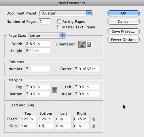
As usual we need a new document (File>New Document) to start. However, this time we’re going to do something a little different. Click the More Options button in the New Document dialog to expose the Bleed and Slug options. Almost all magazine covers bleed off the edge of the paper and we’re going to do just that. Turn off the Facing Pages option near the top and enter a 0.25″ Bleed for the Top, Right, and Bottom (click on the link icon to the right so you can enter different values in each field). Also add a 1.5″ slug at the bottom. Click OK to create your new page.

2 TAKE ADVANTAGE OF SLUGS
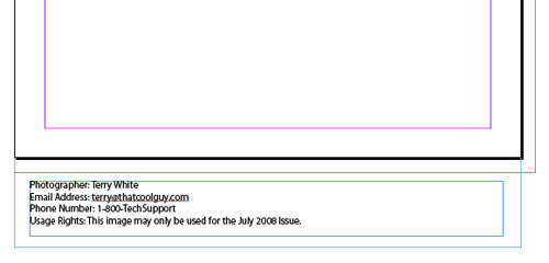
I recommend that you get into the habit of using the slug feature to store important information about the job itself. Think of the slug as a notes area that can be printed if needed. The one thing you’ll definitely want to put in this area for your magazine covers is the copyright information about the photo you’re using. Using your standard Type tool (T), you can include things such as photographer, phone number, email address, and usage rights to this area.

3 CREATE FRAME AND PLACE COVER PHOTO
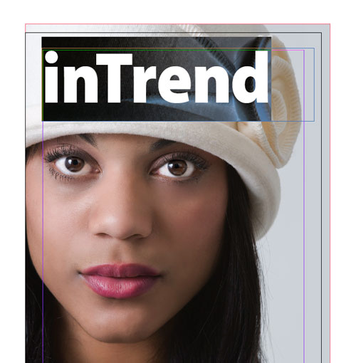
Using the Rectangle Frame tool (F), create a frame that goes to the edge of your bleed area. The cover image is usually what draws the potential reader into picking up the magazine. Things like, “Who’s that?” “Wow, check out that car!” or “He’s/she’s hot!” come to mind. Once you have your frame, use the Place command either from the File menu or Bridge CS3 to place your best photo.


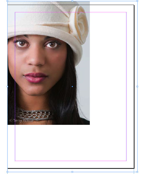
PHOTO CREDIT: TERRY WHITE

4 MAKE IT FIT
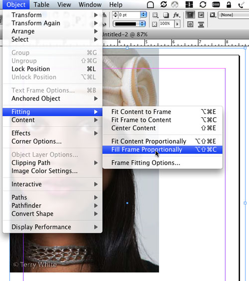
Unless you went into Photoshop prior to this step to size your photo, chances are it came in either too big or too small for your frame. What makes matters even worse is that it’s probably the wrong aspect ratio too. You want your image to fill the frame without distorting, so choose Fill Frame Proportionally from the Object>Fitting menu. While this will definitely fill the frame, it doesn’t mean that it will position the image exactly where you want it. Switch to the Direct Selection tool (A) and then you’ll be able to position the image to your taste.

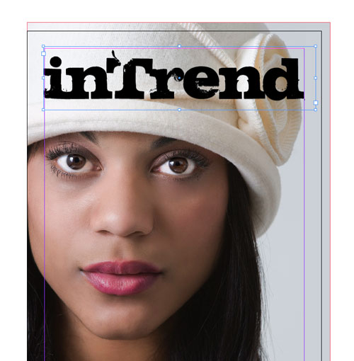
5 CREATE YOUR MASTHEAD
The problem with this particular photo is that there’s no headroom. Photographers are often told to keep the headroom to a minimum in portrait photography. So in this case, we definitely need the masthead to be on top of the photo as opposed to behind it, with the head slightly overlapping it for effect. Create a text frame with the Type tool and key in the name of your publication. If your publication is established, then you probably already have the proper font, size, and kerning values; however, if you’re just starting out, then you’ll want to give your font choice some thought.

6 CHOOSE FONT AND KERN
Aside from your photo, the name of the publication is the next thing that people look at. So clearly it needs to be big, but it also needs to look good. Unless you’re using a script font, chances are your font will need to be kerned at the larger size. I’m using a chunky grunge font at 150 pt and tracking set to –10 in the Control panel. I also individually kerned each letter by eye for a better balance. (Tip: To change the kerning, insert your cursor between two letters and use your Option [PC: Alt] key in conjunction with your Arrow keys.)

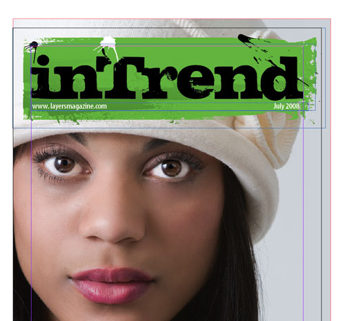
7 ADD DATE, VOLUME INFO, AND GRAPHIC
Now it’s time to put in the particulars about this issue. Usually that means the Month/Year and maybe either the volume number or the website address. In either case, you’ll want to create these in a separate text frame from your masthead for easy positioning. Don’t worry about font color at this point; we’ll get to that in a moment. You can also add a graphic element to anchor your masthead. I chose a rectangular paint smear created in Illustrator and placed it (File>Place) behind my masthead information (Object>Arrange>Send Backward) for more pop.

8 YOUR LEAD STORY
When you see someone on a magazine cover, you want to know why he or she is on the cover, so you need a teaser. This is the story that’s going to make people buy the magazine, thus this copy should be larger than any other teasers. Create a text frame with the Type tool in an area that will have the least impact on your main photo. Type your teaser in a nice large font, and never use the same font that you used for the masthead—it’s all about contrast. (Be sure to turn off the Hyphenate option in the Paragraph Control panel.) Experiment with different font sizes and combinations of upper- and lowercase words.

9 BORROW SWATCHES FROM ILLUSTRATOR CS3
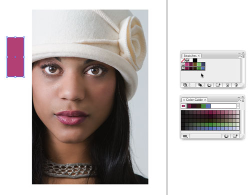
Before we go much further, we need some color swatches to start applying color to our text. If you’re good at picking colors, then you can just go ahead and create your swatches in InDesign. Truth be told, I struggle when it comes to picking colors, so I’m going to let Illustrator create my swatches for me. Open Illustrator CS3 and create a new Print document. Go to the Swatches panel and choose Select All Unused from the flyout menu. Now click the Trash icon to remove them.

10 CREATE MATCHING COLORS AUTOMATICALLY
Place the same cover photo you used in InDesign into your page in Illustrator. Draw a box off to the side with the Rectangle tool (M). Now take the Eyedropper (I) and sample a color in your photo (in this example, the lips). If you bring up the Color Guide panel, you’ll now have a set of swatches that all work well with each other. (Tip: Click on the drop-down menu at the top of the Color Guide panel to view different Harmony Rules.) Choose Save Colors as Swatches from the Color Guide flyout menu to add those swatches to your Illustrator Swatches panel.

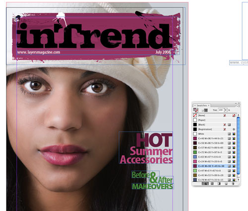
11 EXPORT/IMPORT SWATCHES
Lastly, choose Save Swatch Library as ASE from the Swatches flyout menu and choose a name and location to save your swatches. Back in InDesign, choose Load Swatches from the Swatches panel’s flyout menu and open the ones you just saved. You can now apply these “matching” colors to your text by simply selecting your text with the Type tool and then clicking the swatch you want to use. I also changed the color of the masthead element to tie it all together. Just Control-click (PC: Right-click) on the element and choose Edit Original to open and edit it in Illustrator.

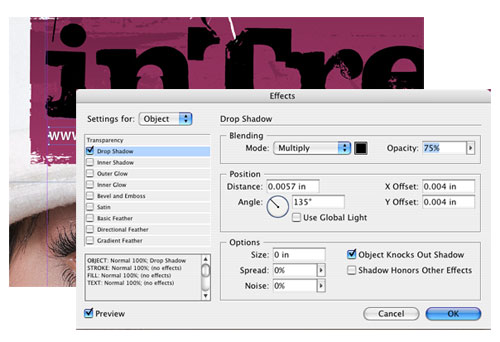
12 THE DROP SHADOW TRICK
Applying different colors to your type often makes it easier to read against a photo in the background; however, designers use another trick to make their text stand out even more. Yes, it’s time for a drop shadow. The trick here is to apply a shadow with a hard edge that’s just slightly offset from the original text. Select your text frame with the Selection tool, and go to Object>Effects>Drop Shadow. Turn on Preview, and set the Size to 0 and your Offset to a small fraction, in this case .004″. Click OK when you like it. It looks great applied to the story titles as well.

13 ADD MORE STORIES AND A PHOTO
I prefer one main photo on my covers, but if you need to put another photo on the page, you’ll want it to be seen, but not overpower the main photo. One way to get around this is to use shapes tools to help hold your smaller photos. You can draw a shape with the Pen tool (P), fill it with color, and then lower its transparency (Object>Effects>Transparency). To see how your cover is going to look printed, go into Preview mode. You can enter/exit Preview mode (as long as you’re not in the Type tool) by pressing the letter W on your keyboard.

Visitor Comments »


Very, very good


Comment by Lucho Lara Rubilar | August 20, 2008 @ 6:49 pm


Thanks for this tutorial, especially the philosophical parts.


Comment by Jeffster83 | August 21, 2008 @ 1:18 am


this creation is very good


Comment by satish kumar | August 21, 2008 @ 7:23 am


Very cool never used InDesign – going to go home and give this a go.


Comment by Dboe | August 21, 2008 @ 11:17 am


This was very cool.


Comment by Tim Smith | August 21, 2008 @ 3:39 pm


Awesome. Thank you


Comment by Remy | August 21, 2008 @ 8:54 pm


I completed a survey recently and want to change one of my answers: I really prefer this type of text *tutorial* over video, because I can study the still photos while absorbing the lesson. Thanks for many great tips!


Comment by KP | August 22, 2008 @ 8:32 am


The only problem I see, is that the main photo was scaled up to fit – thus risking pixelating it. Scaling up should be avoided, but it should be done in Photoshop if needed. Make sure the picture is high quality, at least 300 ppi for print.


Comment by Nix | August 25, 2008 @ 5:43 am


Very cool
Thanks
Don


Comment by don | August 25, 2008 @ 11:19 pm


Great tutorial – this works well with my design students – they can see a method for working on parts of a design. I’ve watched so many of Terry’s podcasts that when I read his words I internally “hear” his voice – that’s weird huh?


Comment by Al Tucker | August 26, 2008 @ 3:27 am


I have CS2, but do not have objects/effects. Old version maybe?


Comment by Nell Elder | August 28, 2008 @ 11:14 am


Great tutorial – learned some new things.


Comment by Kfs0008 | September 3, 2008 @ 9:26 am


Thanks, Im putting a magazine together and this helps some much, do you anyother tips on how to improve a magazine


Comment by C Marc Esend | September 11, 2008 @ 9:36 am


this is so nice. God bless you.
Heizben


Comment by Hazel | September 12, 2008 @ 7:38 am


Wish I had read this before doing my last layout. Oh-well hindsight is always 20-20. That’s my life!


Comment by Nancy Bond | September 22, 2008 @ 10:00 pm


[...] Magazine Cover Design [...]


Pingback by 30 Tutorials That Will Teach You InDesign | Arbenting | October 2, 2008 @ 12:35 am


it does a really good job on explaining how the cover is made. mad dope son.


Comment by a.jewell | October 2, 2008 @ 12:42 pm


i like how it shows the steps and expains everything.
very cool.
:)


Comment by Leah | October 2, 2008 @ 12:43 pm


cool


Comment by connor (the pimp) allen | October 2, 2008 @ 12:44 pm


THIS IS STUPID


Comment by john dorian | October 2, 2008 @ 12:48 pm


kooool


Comment by Nobel | October 5, 2008 @ 1:40 am


Well then I guess I’m STUPID, but I learned something new about the color swatch harmonies in Illustrator as well as the way to import the swatches into In Design. Thanks a lot!


Comment by Analda Harmse | October 5, 2008 @ 11:20 am


i like.
dig the purple.


Comment by tara midkiff | October 8, 2008 @ 4:10 pm


these are good tips


Comment by christy settle | October 9, 2008 @ 7:58 pm


i’m trying to use adobe indesign for the first time.. n you guys surely made a good impression.


Comment by Arun Ghimire | October 15, 2008 @ 7:01 am


wow…fantastic!


Comment by fatimatuzzahrah | October 17, 2008 @ 2:39 am


Well it is pretty hard to find such organized tutorials web site.
This tutorial is really useful.


Comment by Husien | October 25, 2008 @ 3:52 am


It’s awesome.


Comment by Nizam Ahmed | October 30, 2008 @ 1:17 am


very clean and organized. i just glanced at each step and now i feel like i can go do the same thing. thanks!


Comment by Alex Benson | October 31, 2008 @ 2:28 pm


inspiring…!!! and educating…!!! keep it up..


Comment by Ngozi Okafor | November 7, 2008 @ 4:38 am


I loved the swatches piece but when you enlarged the photo you may have pushed the resolution beyond what it needs to print. For instance, if your original placed photo was at 300ppi and it did not fill the frame you created, when you did the Fill Frame Proportionally in all likelihood it went to about 175ppi. For decent printing without pixelating, you just can’t do this. Click on this photo and open the Info panel and it will tell you what your ppi is. Make sure it matches with what your printer (the company that will print your magazine) needs to print. If it doesn’t, you need a new photo. Something with more resolution. That’s why stock houses sell different sizes of prints.


Comment by DrKoob | November 8, 2008 @ 9:55 am


Sorry, it’s not a “masthead.”


Comment by tbh | November 15, 2008 @ 11:23 pm


that’s a simple and straightfoward tutorial.


Comment by tunde olambo | November 22, 2008 @ 10:48 pm


Exactly what I was looking for! Excellent work.


Comment by Doug | December 1, 2008 @ 9:27 am


You did very nice, but maybe be more specific when you talk about certain things. Define the terms you use of the intellectual learners like me.


Comment by niki and alyssa | December 3, 2008 @ 12:26 pm


Thank you!
very useful…


Comment by Tim(Russia) | December 6, 2008 @ 12:19 pm


iam very greatful for this it is very nice art work


Comment by harriet darko | December 17, 2008 @ 9:18 am


This was very helpful.
One question, does this work for tabloid style newspapers? By this, I mean the bleed.


Comment by Dylan | December 29, 2008 @ 7:41 pm


so cool….


Comment by MJ | January 8, 2009 @ 1:03 am


finally some ware that really teaches wat i want to learn.


Comment by Dean | January 11, 2009 @ 4:13 pm


good techniques nice work


Comment by Tasleem | January 19, 2009 @ 5:19 pm


very impressive!


Comment by jigz | January 20, 2009 @ 12:47 pm


indeed! well done! blud!


Comment by mhar (Philippines) | January 28, 2009 @ 7:56 am


this is the best i Sow. thank you!


Comment by Sanjeewa | February 1, 2009 @ 10:58 pm


I would like to Thank you for this tutorial, it helped me so much. I couldn’t understand how to do this reading it from the CS4 workbook(too much confusion). This was much clearer for me to understand, hopefully I can create a masterpiece for my cover!! It’s wonderfully easy to follow for beginners who don’t have a clue where to begin–Thanks again.


Comment by AlleyKat | February 11, 2009 @ 9:58 am


how did you make the rectangular paint smear in illustrator! please help!!!


Comment by ds | February 15, 2009 @ 6:48 pm


thanks for your tutorial!!!


Comment by marzia | February 19, 2009 @ 5:50 am


Good morning. We have too many high sounding words, and too few actions that correspond with them.
I am from Uzbekistan and also am speaking English, give please true I wrote the following sentence: “Having difficulty in getting pregnant? Follow dr chris steele plan on how to get pregnant.”

Waiting for a reply 8), Huy.


Comment by Huy | February 20, 2009 @ 7:16 am


nice and cool cover page


Comment by vijay | February 21, 2009 @ 5:06 am


nice

chewy


Comment by jacj travers | February 22, 2009 @ 10:27 pm


This is a great basic tutorial. Specially the type settings. Thank you.


Comment by Tran Hoai Anh | February 23, 2009 @ 10:21 pm


how did you make the rectangular paint smear in illustrator! please help!!!
Hi there, you can draw a box in ill and then apply the brush with the outline with the same color as filled color. Then expand the box, copy and past it to Indd. Now in Indd you can modify it as well.


Comment by Tran Hoai Anh | February 23, 2009 @ 10:25 pm


discovering this tutorial was a god send, seriously, i was beginining to get migranes everytime i tried to create a cover, thank u!!


Comment by Laila | February 24, 2009 @ 2:27 pm


coolies


Comment by chewy travers | March 1, 2009 @ 10:04 pm


LUV LUV LUV this! :-)


Comment by teelowe | March 15, 2009 @ 8:18 pm


This is the best tutorial I’ve found anywhere on the web. Seriously–this is a lifesaver.


Comment by wonderwoman | March 21, 2009 @ 9:43 am


[...] Homework wk10: For Thought – Read: Becoming Screen Literate http://www.nytimes.com/2008/11/23/magazine/23wwln-future-t.html?_r=1&ref=books Technique for Next Assignment – Read: Magazine Layout Tutorial: http://www.layersmagazine.com/magazine-cover-design-in-indesign.html [...]


Pingback by Week 10 « Digital Design Basics SMC-1031-B | April 13, 2009 @ 7:31 am


[...] Text Threading, Importing Graphics, Using InDesign to compose pages. Magazine Layout Tutorial: http://www.layersmagazine.com/magazine-cover-design-in-indesign.html Practice: see Week10WorkFiles Body Text Generator: [...]


Pingback by Week 11 « Digital Design Basics SMC-1031-B | April 19, 2009 @ 10:14 pm


Can I create a magazine cover for my class using Illustrator? Also how do I import a photo from photoshop into illustrator?


Comment by alleykat | May 7, 2009 @ 11:58 am


Hi Alleykat,

Yes, you could design a cover in Illustrator, though we would recommend that you use InDesign.

Check out this article on importing images from Photoshop to Illustrator: http://www.layersmagazine.com/mixing-it-up-with-cs3.html

It was written for CS3, but most of it should still be relevant.

Thanks,
Chris Main
Layers Magazine


Comment by Chris Main | May 7, 2009 @ 2:24 pm


Awesome!


Comment by Jerry | May 10, 2009 @ 10:28 pm


QUESTION:
what programs do you need to do thiss? :S
is it just microsoft office word??


Comment by joanna | May 20, 2009 @ 5:29 pm


necesito crear una revista entera y me gustaria qe me pudieran ayudar.
y tambien que me dijeran como cambiar el idioma del menu gracias


Comment by gafas | May 22, 2009 @ 5:57 pm


i need to create a ful magazine i wish you can help me .
and i need to know how to change the lenguage of the menu
thanks


Comment by paola | May 22, 2009 @ 6:01 pm


Very interesting


Comment by kristopher | June 23, 2009 @ 4:22 pm


Nice job! I just love it when I learn more about Indesign even though I have been using it for years!


Comment by Angel | June 24, 2009 @ 12:50 am


I appreciate the text tutorials. Is there a way to include a text portion of the video tutorials. Having the text allows you to follow along without having to take notes. You also have steps to follow when you try the project on your own.


Comment by Karen | July 5, 2009 @ 1:48 pm


[...] for Next Assignment – Read: Magazine Layout Tutorial: http://www.layersmagazine.com/magazine-cover-design-in-indesign.html (The assignment will be to revisit our Celebrity Composite Works from Week 04, you are now going to [...]


Pingback by week 07 « Digital Design | July 12, 2009 @ 9:16 pm


[...] Magazine Layout Tutorial: http://www.layersmagazine.com/magazine-cover-design-in-indesign.html [...]


Pingback by week 08 « Digital Design | July 19, 2009 @ 11:05 pm


thanx for the tutorial, it will be a great inspiration since im new with indesign


Comment by keletso | July 23, 2009 @ 7:02 am


this tutorial was very helpful.
however I am having trouble understanding how you accomplished the masthead. What is kerning and how can I do it?

Also, is there any way to make a paint smear using either PhotoShop or Indesign?


Comment by Samantha Martinez | August 6, 2009 @ 3:29 am


As a beginner this is very useful . Thanks soooooo much..


Comment by Wickum | August 10, 2009 @ 1:34 pm


[...] Magazine Cover Design in InDesign [...]


Pingback by 20+ Stunning Tutorials of Adobe InDesign by LayersMagazine | X Design Blog | August 15, 2009 @ 11:55 am


[...] Magazine Cover Layout Tutorial. [...]


Pingback by Indesign Magazine Cover Layout « Vishal Dawda | August 23, 2009 @ 10:01 pm


Yo yo yo


Comment by Lara richens | September 28, 2009 @ 4:04 pm


[...] Create a Magazine Cover Design (Id) [...]


Pingback by The Ultimate Round-Up of Print Design Tutorials | iV Blog | October 3, 2009 @ 9:00 am


[...] Create a Magazine Cover Design (Id) [...]


Pingback by The Ultimate Round-Up of Print Design Tutorials | WEBDESIGN FAN | October 5, 2009 @ 12:10 am


[...] Magazine Cover Design [...]


Pingback by High Quality InDesign Tutorials,photoshop,design,Photoshop plugins, Plugins | Cosmos Blog -- Internet News,Life,Culture,Polices,Resource,Make Money | October 5, 2009 @ 1:15 am


Very interesting and away some!


Comment by Anil Yadav | October 8, 2009 @ 6:09 am


thats cool but i think you should have put more words on it no affence and the girl on the front is ugly


Comment by katie | October 16, 2009 @ 5:20 pm


[...] Tutorials by layermagazine [...]


Pingback by Print Design : Top 5 print design tuts. « Web Developer Juice | November 9, 2009 @ 12:48 am


that is the graetest in the world you have to try it


Comment by shaz | November 17, 2009 @ 3:06 am

Leave us a comment

Comments RSS | TrackBack URI

Back to Top


Advertisement
Creative Suite Tutorials
  1. Photoshop Photoshop
  2. Illustrator Illustrator
  3. Indesign Indesign
  4. Dreamweaver Dreamweaver
  5. Fireworks Fireworks
  6. Premiere Premiere
  7. Flash Flash
  8. After Effects After Effects
  9. Lightroom Lightroom
  10. Acrobat Acrobat

Get the latest tips, tricks and news delivered straight to your inbox.

From our Partners
Subscribe to Layers Magazine


  • Back to the Layers Magazine Homepage
  • Creative Suite Tutorials
  • Layers Magazine
  • Reviews on top products
  • Layers Magazine Reader Forums
  • Subscribe to Layers Magazine