
Photorealistic Illustration
Photorealism is not a new art form; it has been lurking in the shadows of the art world with its dedicated few re-creating reality in a variety of media such as paints, colored pencils, and airbrushing. It seems that in the past several years, photorealism has caught the attention of a new generation of artists. While many still dabble in traditional methods, digital imaging technology has made it easier (and a lot less messy) to create photorealistic images.
What Is Real?
To understand the concept of photorealism, it’s important to understand how the human eye sees, and more importantly, how we know what’s real. This was one of the more profound observations made in the hit movie The Matrix. While trying to explain the concept of the Matrix to Neo, Morpheus asks, “What is real? How do you define real? If you’re talking about your senses—what you feel, taste, smell, or see—then all you’re talking about are electrical signals interpreted by your brain.”
When you look at an object, what you see is a reconstruction of the object that’s based on the light entering your eyes. An object will reflect light at different wavelengths. This light enters the eyes and is converted to an electrical signal which travels to the brain and is re-created to give us what we see as an object. This all happens in an instant. Our brain quickly extracts information from these light wavelengths to define color, form, perspective, and shading or lighting. So this means that the world we’re seeing is our brain’s reconstruction of the data gathered from the many wavelengths of light.
So what does this have to with photorealism? Consider this piece by photorealistic digital artist Bert Monroy. Bert is considered one of the true pioneers of digital art and has been wowing people for years with his realistic digital paintings. In this piece titled Red Truck, we see the headlight and partial body of an old truck. Our brain is telling us we’re seeing a red truck because it has interpreted the various wavelengths of light to define the form, color, perspective, and lighting of a red truck.

Bert has manipulated the pixels in Photoshop to simulate the light wavelengths that the actual truck would reflect in those lighting conditions, and because our unconscious mind can’t distinguish between what’s real and what’s simulated on paper or on a computer monitor, it appears to be realistic. Now, of course, it’s not real in the sense that we can touch it and feel the contour of the objects; it has merely convinced our brains that it seems real. Knowing this, we can surmise the eye is easily fooled, which is why we’re able to enjoy movies and TV shows. This is quite an advantage to the photorealistic artist as well. With an understanding of the principles of color, form, perspective, and most importantly, lighting or shading, an artist can implement these consciously into his work.
Let’s examine each of these principles through a series of examples:
Form
Form is defined as the external, three-dimensional outline, appearance, or configuration of something. It’s the basic shape of an object. It’s how we know that a basketball is spherical or that a stop sign is octagonal. The form or shape of an object can be determined even in the absence of perspective or color (think silhouette). Understanding form is the basis of illustrating something realistically.
STEP ONE:
Here’s an example of one of the techniques I use to create realistic objects in Photoshop. Start by using the Pen tool (P) to draw half of the shape of a lamp as shown here. (Make sure the Pen tool is set to Paths in the Options Bar.) Load the path as a selection by pressing Command-Return (PC: Ctrl-Enter). Click on the Create a New Layer icon in the Layers panel to create a new layer. Click on the Foreground color swatch and choose 50% gray in the Color Picker (C:0, M:0, Y:0, K:50). Press Option-Delete (PC: Alt-Backspace) to fill the shape with gray.

STEP TWO:
Duplicate this layer by dragging it to the Create a New Layer icon. Then, simply flip this layer horizontally by going under the Edit menu and choosing Transform>Flip Horizontal. Use the Move tool (V) to position the straight edges of the two lamp halves right up against each other. This will define our basic shape. Simply merge these layers together by pressing Command-E (PC: Ctrl-E). Although it’s merely a shape, we’re off to a good start because we’re able to tell it’s a lamp just by the shape alone. Now we need to consider perspective.

Perspective
Perspective is what gives an object depth. Depending on the angle that we’re viewing an object, we need to consider what’s going to be visible and what will be hidden. By looking at the shape of the lamp we can determine that the horizon line is just above the bottom of the base. Having established this, we can now determine that we’ll be viewing the lampshade at an upward angle. This will reveal the inside of the lampshade on the backside, with the neck of the lamp going up until it’s hidden by the front of the lampshade.
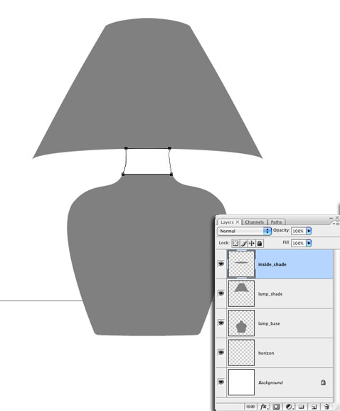
STEP THREE:
Use the Elliptical Marquee tool to draw a selection around the bottom of the lampshade to define the area that we’ll see the inside of. Once the selection is in place, press Shift-Command-J (PC: Shift-Ctrl-J) to cut this area out to its own layer. Click the Eye icon in the Layers panel for this new layer to hide it temporarily. Use the Rectangular Marquee tool to select the remaining portion of the lampshade. Make the main lampshade layer active in the Layers panel, and press Shift-Command-J (PC: Shift-Ctrl-J) again to copy this section to its own layer.

STEP FOUR: Use the Pen tool to draw a path to complete the shape of the neck. Activate the base layer and load the path as a selection. Fill with 50% gray to complete the shape. Now each piece should be on its own layer: the main lampshade, the inside portion of the lampshade, and the base. So with the shapes and perspective set, let’s move on to color.
Color
Now here’s a good question: Is color real? Light enters our eyes and the color information is received by tiny photoreceptors called cones. The brain then interprets this information into the colors we see. So color is subjective. Whether you know it or not, you have a role in how real something appears to you because your brain has to reconstruct what you see. In reality, an object reflects a certain color. That color passes through the given lighting conditions, through the atmosphere into our eyes. So it’s virtually impossible to see an object in its purest color form. Unless, of course, you’re in controlled lighting conditions, but even then there’s some inconsistency.
STEP FIVE:
So let’s reverse engineer that thinking to our lamp. We have a shape, so let’s apply a color. Duplicate the base layer, and then hide the lampshade and the top copy of the base layers. Change the Foreground color to a flat red and fill the bottom copy of the base with that color by pressing Shift-Option-Delete (PC: Shift-Alt-Backspace). This layer will remain unaltered from this point because we’re going to build the light and shading over multiple layers, leaving the color information untouched. It will make sense in a moment. Let’s talk about lighting.

Lighting
Lighting is the most critical element. In the next steps, we’ll essentially be painting with light. This is what I like to call layers of light. Photorealistic illustrations viewed on a computer screen are much more convincing to the eye because a computer screen is capable of transmitting wavelengths of light that would otherwise be impossible to see with printed images. This is also why printed images often look less vibrant than what we see onscreen. Printing technology has certainly improved over the years but it’s simply the difference between reflected light and transmitted light.
STEP SIX:
Continuing with the lamp, switch to the Burn tool. In the Options Bar, set the Range to Midtones and the Exposure to 50%. Hide the red base layer and make the gray base layer visible and active. Then use the Burn tool to paint in the shadow tones to define the form. Use the Dodge tool (also set to Midtones) and paint to give the hint of a light source from the front and reflected light on the sides. By working on a gray-filled object, you can concentrate on the lighting separate from the color.

STEP SEVEN:
Now we need to change the blend mode of this layer so that the lighting effect will interact with the color in the layer below. Which blend mode depends on how intense the shading is and the color you’re blending with. For the lamp here, we chose Multiply. This will blend the dark areas with the color layer (make sure to make the color base layer visible again). As you can see, the object has taken on a whole new dimension. In just two layers we’ve taken a simple shape and created a seemingly real shape. This is because of the “light” layers.

STEP EIGHT:
Now let’s take it a step further and duplicate the light or shaded layer and change its blend mode to Soft Light. Apply a Plastic Wrap filter (Filter>Artistic>Plastic Wrap) to add subtle hints of reflected objects in the surface of the lamp. The result, as you can “see,” is a seemingly dimensional object. Notice that we did it with only three layers.

STEP NINE:
We have the basic form, color, perspective, and lighting all in place for the base, so let’s move on to the lampshade. We’ll start by creating the light emitting from the lamp itself. Make the layer that depicts the area of the inside of the lampshade visible and active. In the Layers panel, move this layer below the base layers so it will appear behind them. Fill the shape with white, then apply an Outer Glow layer style by clicking the Add a Layer Style icon at the bottom of the Layers panel and choosing Outer Glow. (I’ve filled in the background with a gradient so it’s easier to see the Outer Glow.)

STEP TEN:
Next, activate the main lampshade layer and make it visible. Just as we did with the lamp base, duplicate the layer and apply a color, such as a yellow or light brown, to the bottom copy. Then use the Dodge and Burn tools on the top gray layer to paint in the light and shadow areas. Change the blend mode to Hard Light. When done, merge these layers together by pressing Command-E (PC: Ctrl-E). Duplicate this layer and change the blend mode to Multiply. This will increase contrast and intensity. If it seems too much, simply drop the Opacity of the layer in the Layers panel.

STEP ELEVEN:
Lastly, we need to create the light source itself. Create a new layer and place it above all the other layers. Select the Gradient tool (G) in the Toolbox. Then in the Options Bar, click the gradient preview to open the Gradient Editor. Select the Foreground to Transparent gradient, which is the second icon in the Presets area, and click OK. Choose the Radial gradient and set the Foreground color to a very light yellow color. Estimating where the light should be inside the lampshade, click-and-drag the gradient down from that point to the base of the lamp neck.
Change the blend mode of this layer to Pin Light. Duplicate this layer and change the blend mode to Vivid Light. This will increase the intensity of the light itself. All there is left to do is to add the finishing touches, such as the reflected light on the neck and top of the base of the lamp and the reflection of the lamp on the table surface.


Understanding light, form, perspective, and color are all necessary to achieve photorealism. By creating the lighting effects on gray layers and using blend modes to mix them with color below, we have more control over light as well as the coloring. (If I want to change the color of this lamp, all I need to do is fill the color layer with a new color—all the shading will remain intact.)
Let’s wrap things up here with a simple assignment: When you’re out in the “real” world going to work, traveling on vacation, or just hanging at the mall, pay close attention to the behavior of light around you. Don’t necessarily look at an object itself, but rather look at the light and how it’s reflecting off an object. How is the object reflecting off other objects? Look at the absence of light. Look at the way other people react to what they see. Just stare at things—stare at yourself in the mirror. Look at the tiniest, most mundane things around you and how they look in the light.
These are the things that photorealistic artists pay close attention to. They’re constantly “seeing’ things and figuring them out. When you do this, I guarantee that you’ll start to see things a lot differently. It gives new meaning to the words “open your eyes.” Also, if you’re interested in the science of sight, I highly recommend a book called Visual Intelligence: How We Create What We See by Donald D. Hoffman. It’s an interesting exploration into how the human eye perceives light and creates the world we see.

