
Production Premium: Professional Color Correction
Some of the most important effects you’ll find in your Premiere Pro toolbox are those for color correction. Let’s face it, shooting perfect video can be tough: conditions change, time can be crunched, and there’s never enough light—give up, right? Nope, fix it in post. Getting great color is significantly easier when you combine good production practices with the right filters in post.
[If you’d like to download the project files used in this tutorial to practice these techniques, click here. All files are for practice purposes only.]
1 [MATCH YOUR CAMERAS]
Whether you’re giving a technical demonstration or just an in-depth interview, the option to shoot with more than one camera makes editing much easier. Rolling multiple cameras at once ensures you have another angle to cut to and that the footage will stay in sync. What often happens, though, is that it becomes jarring as the editor cuts from one angle to the next. This is because the cameras aren’t matched. To make color matching easier, do your best to shoot with similar or identical cameras and to set the cameras to the same menu settings.

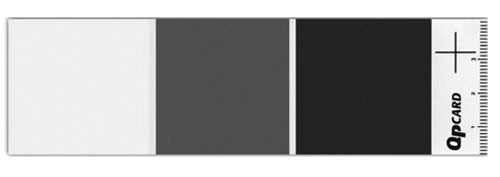
2 [USE A CALIBRATION CARD]
If you want great color, then using a calibration chart can really come in handy. There are several options here, but what’s important is that you have a clean shot of a card with pure black, pure white, and neutral gray. One option is the QPcard (www.qpcard.se) that offers disposable, self-adhesive cards. The QPcard 101 calibration card runs about $14 for a three-pack and the advantage here is that you can toss the card once it gets faded. Another choice might be the PhotoVision Digital Calibration Targets (www.photovisionvideo.com) that range in size and cost between $30 and $100.
3 [WHITE AND BLACK BALANCE IN THE FIELD]
Don’t think that fixing it in post means you can screw it up in the field. Always use the white and black balance options on your camera. Be sure to zoom in tightly on the calibration chart and balance your cameras. Anytime you change a battery, move locations, or move lights, you’ll want to rebalance your cameras. If you’re using natural light (such as the sun), remember that it moves so, depending on the time of day, you may need to recalibrate your cameras. Once your shot is set, don’t forget to roll actual footage of your reference chart (you’ll use it in post).

4 [LOAD FOOTAGE WITH ANGLE INFO]
When you digitize or transfer your footage, be sure to include information that can help you color correct. Load information such as camera angle, tape number, and date. That way, you’ll only need to color-correct the first shot in the scene or location. Once the shot is fixed, you’re able to reuse your color effects; but to do this, you’ll need good information to help identify your clips.
(For hands-on practice, you can download the practice project we’re using here from layersmagazine.com )

5 [SET UP A COLOR CORRECTION WORKSPACE]
To make color correction easier, choose Window>Workspace>Color Correction. This will switch you to a specialized layout optimized for color correction. (To ensure that you’re working in the default Color Correction workspace, go ahead and choose Window>Workspace>Reset Current Workspace, as well.) Make sure that Draft Quality isn’t chosen in the Program Monitor flyout menu. While you’re in the flyout menu, you can set the Program Monitor to something more useful, such as a Waveform monitor, which can help show you areas that aren’t broadcast safe.

6 [COLOR CORRECT REFERENCE CLIP]
Select the first clip in your Timeline that has the reference chart in it (this will be the first shot in the Calibrated Angles Timeline). The best effect to use for color correction (especially when you have a reference chart) is the Three-Way Color Corrector. In the Effects panel, click to expand the Video Effects, then click to expand the Color Correction effects. Select the Three-Way Color Corrector and drag it onto your first clip.
(Tip: If you want to jump right to the Three-Way Color Corrector, you can type the word “three” into the Contains field at the top of the Effects panel.)

7 [SET THE BALANCES]
To color balance the shot, you’ll need to position the Current Time Indicator so the reference card is clearly visible (for the sample project, 02:28). In the Effects Control panel, click to expand the Three-Way Color Corrector. You can now use the Balance eyedroppers to fix the Black, Gray, and White Balance (in that order). Click on the Black Balance eyedropper and then click once on the black swatch of the reference card. Repeat for the Gray Balance and White Balance droppers. You’ll notice that the hue balance wheels have had their magnitude control points adjusted to remove color cast.

8 [ADJUST WHITE AND BLACK LEVELS]
While you performed a white and black balance on set, the clip can still benefit from adjusting levels. Click the Black Level eyedropper and sample black from the reference card. Repeat for the Gray Level and White Level eyedroppers. The shadows and highlights are stronger in the image but the image isn’t broadcast safe. If you view the Waveform monitor in the Reference window (choose YC Waveform from the flyout menu), you’ll see that the luminance exceeds 100 on the IRE scale; we’ll fix this in a minute.

9 [ADJUST SATURATION]
While we have a pleasant contrast in the image, the Saturation can be pushed a bit. This is especially true if you have vivid color objects in the frame. Switch the Tonal Range pop-up menu in the Effect Controls panel to Midtones—this is where most of the skin tones and objects are situated. Increase the Midtone Saturation to 125%. By targeting just the midtones, you can limit the saturation change to the areas that need it most without impacting the shadows or highlights.

10 [MAKE IT LEGAL]
All of the tweaking we’ve done to the shot has pushed the saturation and luminance values outside the “legal” range. By legal, we mean following the acceptable standards of broadcasters. Even if you don’t intend to show it in a broadcast environment, following standards helps ensure the show’s appearance on television sets. To make this “legalization” easy, simply go back to the Effects panel and apply the Broadcast Colors effect from the Color Correction group.

11 [SAVE EFFECT]
To save time, once the master shot is color-corrected, you can reuse the color effect on all other appearances of the shot in a Timeline. First, save the effect: The easiest way to store the effect is to save it as a preset. In the Effect Controls panel, click the Three-Way Color Corrector effect, then click the Effect Controls flyout menu and choose Save Preset. Name the effect “Camera A, Scene 12.” (See how that camera angle and scene info comes in handy?) The effect preset is added to the Presets folder in the Effects panel.

12 [REUSE EFFECT]
To reuse an effect, simply drag-and-drop. By naming your effect presets clearly, you’ll know where to use them and remember that you can make subfolders to organize your presets by job. When a job is done, click on the saved preset, and then click the Trash icon at the bottom of the Effects panel. The key here is consistency with your color correction while moving at a fast pace.

13 [CHECK THE SHOW]
Once a show is “done,” it needs to be checked. Reviewing your show on a color-calibrated, broadcast-quality monitor ensures that what you think a shot looks like will hold up in the real world. While many editors work with laptop screens or computer displays, you need to actually check your video on a professional video monitor. This will often mean using a CRT-style reference monitor attached to a professional video capture card. This extra investment in hardware is essential to a truly professional workflow.

©ISTOCKPHOTO/ANDREW BREAN
