Quick Logos with Live Trace in Adobe Illustrator

Perhaps one of the most underutilized features in Illustrator is Live Trace, which can convert any photograph into vector art in just a few clicks. In this tutorial, we’re going to use Live Trace to vectorize a photo for a logo design. Now, of course, all images are different, so depending on the final effect you want to achieve, you’ll need to experiment with the settings that we’ll be using here.

1 PICK YOUR PHOTO
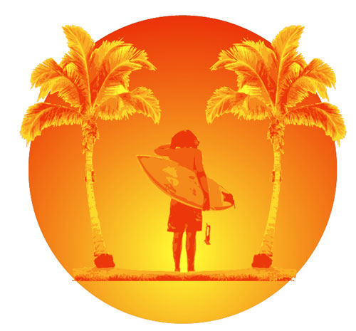
What we’re creating here is a logo for a surf shop, so we’ll start with a photograph. Here we made a composite photo of a couple of palm trees along with a surfer against a white background and saved it as a Photoshop file.
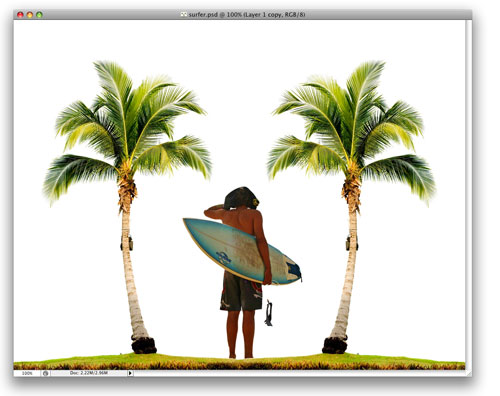
CREDIT FOR PALM TREES: ©FOTOLIA/YONG HIAN LIM
CREDIT FOR SURFER: ©FOTOLIA/TARZOUN

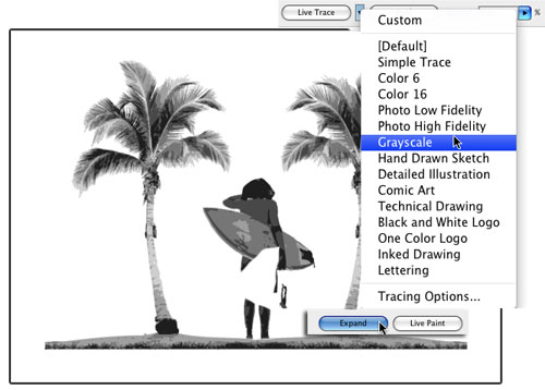
2 CONVERT TO GRAYSCALE AND EXPAND
In Illustrator, create a new RGB document and go to File>Place. Locate the file you prepared above and click the Place button. Once the image is placed, keep it selected. Locate the Live Trace button in the Options Bar, click on the arrow next to it, and choose Grayscale (this may take a moment). When it’s done, click the Expand button in the Options Bar. When the paths are revealed, go to Object>Ungroup, then select the white background with the Selection tool (V) and press Delete (PC: Backspace). Delete the white between the surfer’s legs as well. The grayscale graphic should be all that remains.

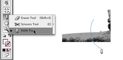
3 TRIM GRAPHIC WITH KNIFE TOOL
The ground extends a little farther out than we need for the final logo, so let’s trim it up with the Knife tool (it’s grouped with the Eraser tool in the Toolbox). On the left side, start above the ground and click-and-drag across the art to cut it. Do the same to the other side, and then select these areas. If more than the cut areas are selected then you probably need to ungroup them. Go under the Object menu and choose Ungroup. Reselect only the cut areas and press Delete (PC: Backspace).

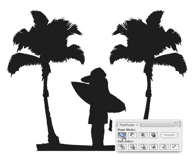
4 DUPLICATE; EXPAND ORIGINAL
Press Command-A (PC: Ctrl-A) to select the entire graphic and group it all together by pressing Command-G (PC: Ctrl-G). Go under the Edit menu and choose Copy and then choose Paste in the same menu. Move the duplicated object out of the way for now. Select the original object, and open the Pathfinder panel under the Window menu. Hold the Option key (PC: Alt key) and click the Add to Shape Area button in the Pathfinder panel to combine and expand all the shapes in the original object at the same time.

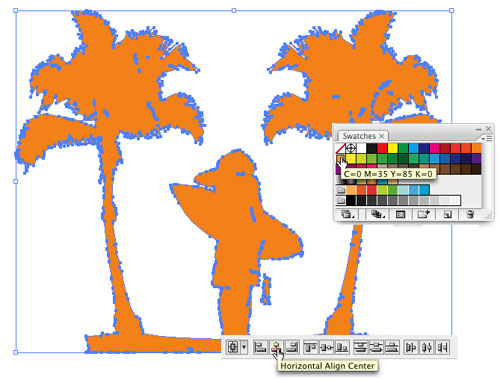
5 COLOR ORIGINAL; ALIGN WITH GRAYSCALE
Now open the Swatches panel in the Window menu, and using the default set of CMYK swatches, choose the first swatch on the second row. This will establish the base color of the entire logo. Select both the color shape and the duplicate grayscale shape and align them by clicking the Horizontal Align Center and Vertical Align Center icons in the Options Bar.

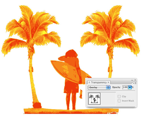
6 CHANGE BLEND MODE TO OVERLAY
Select just the grayscale shape, and then go to the Window menu and select Transparency. Change the Blending Mode pop-up menu at the top of the panel from Normal to Overlay. This will create an interesting color effect as it blends with the color shape just below. This is now the heart of our logo design. Let’s add the remaining elements around it.

7 DRAW CIRCULAR BACKGROUND
We need to create a circular background shape to frame the graphic, so grab the Ellipse tool (it’s grouped with the Rectangle tool in the Toolbox). I like to draw circles out from the center because it helps with the initial placement, so click in the approximate center of the graphic, hold down Shift-Option (PC: Shift-Alt), and drag outward to draw a circle proportionately from the center. Fill this shape with the same orange color used for the main graphic, and go to Object>Arrange>Send to Back.
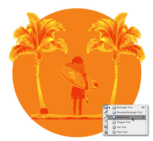
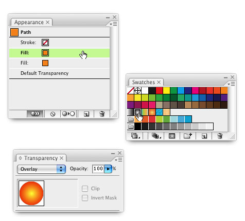
8 DUPLICATE FILL
Open the Appearance panel from the Window menu. Grab the Fill item and drag it to the Duplicate Selected Item icon at the bottom of the panel. This will create a new instance of that fill. With the top Fill item selected in the Appearance panel, go to the Swatches panel and click on the default white to black radial gradient. Then open the Transparency panel and change the blend mode to Overlay once again.


9 REPOSITION GRADIENT; ADD STROKE

This will give a variation of the background without using the gradient editor. Plus you can quickly go back to the solid color by simply throwing away that instance of the Fill containing the gradient in the Appearance panel. To change the location of the colors in the gradient, simply drag the Gradient tool (G) anywhere in the circle. Here, we clicked between the surfer’s legs and dragged just above his head. To complete the circle, apply a 5-point stroke with a slightly darker orange to give it a more finished look.

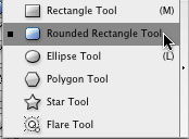
10 ENTER SETTINGS FOR ROUNDED RECTANGLE
We need to draw a rounded rectangle for our logo name. Back in the Toolbox, go into the shape tools again but this time grab the Rounded Rectangle tool. The roundness of the corners depends on the size of your graphic. To change it, click once on the artboard to open the Rounded Rectangle options. Set the desired Width, Height, and Corner Radius (you may need to experiment). In this example, we use a Width of 790 pt, a Height of 140 pt, and a Corner Radius of 50 pt.


11 FILL AND STROKE RECTANGLE
Once you click OK in the Rounded Rectangle dialog, your rectangle will appear on the artboard. Drag the shape to the bottom of the graphic. Color this shape the same way you did the circle shape: Fill it with the same orange color, give it a darker 5-point stroke, duplicate the Fill in the Appearance panel, apply a white to black gradient (except this time choose the linear gradient swatch rather than the radial gradient and then set the Angle to –90˚ in the Gradient panel), and change the blend mode in the Transparency panel to Overlay.

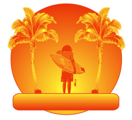
12 TYPE IN LOGO NAME
Now just enter some text for the title. Here we set the name in Poplar Std Black then scaled it to fit within the box. Set the Fill and Stroke of the text using similar colors to the other shapes. Of course, depending on your particular image, you may want to experiment with other type styles and fills.

Final Logo

Visitor Comments »


Very nice way to create some different/cool art.

Rather than selecting white – direct select an area (select same fill color) and delete to use different photos on different colored backgrounds. Finally then try different blend modes at step 6. Neat and versatile.


Comment by Gary Spedding | March 6, 2009 @ 6:20 pm


thanks dear. what a maxxa design.


Comment by Saranga Asith | March 8, 2009 @ 12:12 pm


I’m just learning Illustrator and this is great! thanks so much


Comment by Anne Norton | March 10, 2009 @ 4:55 am


[...] Quick Logos with LiveTrace in Adobe Illustrator: by Corey Barker [...]


Pingback by New Tutorials: Illustrator, Photoshop, & Lightroom | Layers Magazine | March 10, 2009 @ 9:26 am


The tutorial is very cool. I tried it for about an hour and for whatever reason I had to use the multiply blend mode to get an effect. When I used overlay I just got a different shade of the color.

I followed the directions to the tee, but then again I do not know Illustrator well.

Any suggestions???


Comment by Daniel | March 12, 2009 @ 12:46 am


When converting to grayscale you might want to make sure your picture has a good contrast so the end result will be better.


Comment by Wilbert Corts | March 16, 2009 @ 11:31 am


I had some difficulty with the transparency step. It didn’t seem to work as described in the tutorial. I just got bright yellow shapes instead of nice variations of color even when I applied the overlay blending mode to the black to white gradient fill. Perhaps there is a setting I don’t know about? Has anyone else had this problem?


Comment by Amanda Sorensen | March 17, 2009 @ 12:00 pm


I am missing something, when I “ungroup” and then select the white background, and delete, my logo dissappears? I am left with a plain white area and no logo?


Comment by carl | March 21, 2009 @ 11:31 am


thanks


Comment by Deepak C. Wakde | March 22, 2009 @ 3:19 am


I had the same problem as Amanda in the transparency step from the circle/sun. Any clue why several of us had this problem?


Comment by Janell | March 23, 2009 @ 6:21 pm


Quick logo? Ha! Is this a joke? This is why the graphic design industry sucks. Sorry, but that is no logo at all.


Comment by German | March 31, 2009 @ 4:00 pm


Please, accept the critic. That’s not a logo. It’s not even close to a logo.


Comment by German | April 1, 2009 @ 9:28 am


I tried this too just for fun and I couldn’t get the opacity to work with overlay as well. I used a image with good contrast and when I applied the transparency my shape/image was just yellow. I feel pretty confident with illustrator since I use it daily, and this wouldn’t work at all. Can someone please post up that it works with overlay and how, I am curious to know if this works at all.


Comment by Chip | April 7, 2009 @ 12:28 am


You Rock!

Thanks for the tip


Comment by kaching | April 8, 2009 @ 3:37 pm


@ German: Stop calling yourself “German” – you give people like me a bad name with your rude behavior.

Great Tutorial – as always guys.


Comment by Illustrator | April 11, 2009 @ 2:36 pm


@ Illustrator: I’m sorry, that’s my name: Germán. And it’s not a rude behavior, please accept criticism. By the way, that’s not a logo, and that it’s not the process to get a logo. Maybe a traced illo, but a logo, never. And if you think this is a “great” tutorial, stop calling yourself “Illustator” you give people like me a bad name with your ignorance.
And yes, maybe I’m rude, but I’m tired of finding lots of crap in this kind of tuts sites.
Have a great day, anonymous illustrator.


Comment by German | April 15, 2009 @ 12:55 pm


Everybody relax! To some, this is a great tutorial that showed them something they didn’t know about Illustrator. To more advanced users, it’s useless drivel. While agree that it is fairly overblown to be called a logo, it is just a means to show the tools available. The point is, everyone needs to start somewhere and these are the kind of tuts that help. And everybody knows that Canada is the true seat of evil.


Comment by Jon | April 16, 2009 @ 2:11 pm


I found this website very helpful and it’s managed by some great people who loved to educate and spread knowledge. The GERMAN person who has commented on this If you are so capable of doing something and you do have more knowledge why comment on somebody’s work and not to conduct something better and teach people . But i guess it takes time, money and great courage to keep up the good work but i guess criticism is easier to do which you have chosen.


Comment by S Raheemani | April 17, 2009 @ 4:39 am


“Please accept criticism”
That’s a funny one. The problem is you didn’t criticize at all. All you did was making fun of a process that could lead into the design of a logo. If you would know how to criticize you would have picked up the flaws of the tut by stating that the process itself is very well explained but that most logos can be reduced to a much more simplistic design.
Stating that “This is why the GD industry sucks…” or “That is not even close to a logo” without giving any reasons for your statement is not criticism but mental garbage.
If you know how to do it better, please feel free to write a tutorial and post it to the community.


Comment by Illustrator | April 21, 2009 @ 10:02 pm


I would have to agree that something seems to be missing to produce the color variation we see in this tutorial. I could not achieve the same results using “overlay” in Transparency.

As for German’s comments, there seems to be an individual like this in every forum. Since the tutorial really concentrates on the utilization of “Live Trace” is German’s point even valid? It’s certainly not important enough to “flame” anyone, be it the author of the tutorial or someone who posts.


Comment by Mike | April 22, 2009 @ 7:49 am


On further experimentation, I was able to duplicate closely what this tutorial had done with the addition of an opacity mask for the grayscale. There might be an easier way and I would be interested in learning it.


Comment by Mike | April 22, 2009 @ 9:25 am


I found this tutorial very frustrating & misleading!!

More power to Chip & German (see comments above) who have also been frustrated & called it as it is!!!

Why waste everyone’s time with tutorials that do not work?

Like most comments found on this page – the overlay blend step DOES NOT WORK. I can only replicate this effect (as shown) by taking it into photoshop. When using the multiply blend mode (using illustrator) you get an effect nothing like what is shown in this tutorial’s step by step images. Personally I think that overlay step effect was executed in photoshop!

It is sad, but I suspect the author of this tutorial must get their rock’s off watching all the personal slanging that has followed this misleading tutorial.

Otherwise, I think the “OVERLAY” problem would have been clarified/ rectified by now!


Comment by Tutorials SHOULD be able to be replicated! | May 3, 2009 @ 2:35 am


[...] 1. Quick Logos with Live Trace in Adobe Illustrator [...]


Pingback by 40 Logo Design Tutorials | Design-Tut+ | May 7, 2009 @ 5:25 am


Wow, this is interesting. I’ll try this one right now.


Comment by GourdBreaker | May 8, 2009 @ 10:32 pm


The overlay doesn’t work. How can achieve the same effect???


Comment by GourdBreaker | May 8, 2009 @ 11:01 pm


Instead of Overlay try Multiply under the transparency menu… I had the same trouble with the whole image disappearing with Overlay. But Multiply for the win.

Although being a Graphic Designer myself, this type of logo is a bit lamo. Still helpful tutorial.


Comment by Millz | May 11, 2009 @ 5:13 pm


I’m ashamed at some of you. Why is it necessary to slam somebody’s work, rather than just say “I found an error” or “I found something that didn’t work the way you said,” and then offer or ask for a possible solution? This is one reason why I do NOT read most comment sections. Too many immature people who should know better, and only want to try to make themselves feel superior by slamming someone else’s work or techniques. I read the tutorial, try it for myself, and if it doesn’t work, I either figure out why or go back to the author if possible to ask why it didn’t work.

Having said that, I am a first-year art/web design student and personally, I appreciate the time and effort he put into this tutorial. I learn a lot from these (or I don’t if they truly are bad), but I don’t waste my time and be incredibly rude by cluttering up the comment section with immature garbage, trying to make him or her feel bad.

I DID learn some new things from this tutorial, things I can apply to other work and helps me learn Illustrator and, just incidentally, get better grades in my art classes. So, Corey… from me to you, thank you!


Comment by BayAreaRed | May 12, 2009 @ 12:24 am


I’m currently working on this particular tutorial and have come close to the end result. As a first year design student I enjoy tutorials such as this one. Tutorials allows me to expand on the basics I learn in school. Please keep a watch out for a future post, Once I figure everything out about this tutorial I’ll be more than glad to post tips that I used.


Comment by Thomas Crews | May 14, 2009 @ 6:34 pm


Hello! If you have problem with blendings try not to use CMYK, couse blendings dont work property in this mode. Use RGM color mode and overlay will work great.


Comment by jacek | May 17, 2009 @ 6:56 pm


Thanks jacek, didn’t think about that. It’s been so busy with school I have not had the time to work on this tutorial anymore. I just happen to check it back out and found your posting. Thanks again.


Comment by Thomas Crews | June 13, 2009 @ 5:03 pm


Awesome tutorial. A lot of fun to do. Thanks for sharing!


Comment by jason lander | June 22, 2009 @ 6:32 pm


A very poorly written, confusing and frustrating tutorial.

If you are having problems following this you are not alone.


Comment by Steve D. | August 7, 2009 @ 1:07 am


I’m still a novice with Illustrator, am lucky enough to have CS4….. and I got thru this tutorial twice, in different color combinations with the same original image – I used a colorful fish, deleted its background but kept the ‘floor’ beneath it…… I’m an experienced designer and even I could make this work, and tho I did leave the cmyk, maybe the suggestion for the rgb would work better or differently. The main thing to learn from this tut is the Live Trace thing – THAT’s very cool!!! Thanks ;-)


Comment by pearlie | August 11, 2009 @ 3:22 pm


I am having the same problem as Carl, who wrote the following comment: “I am missing something, when I “ungroup” and then select the white background, and delete, my logo dissappears? I am left with a plain white area and no logo?”

I am able to select specific little areas, drag them out of the picture, then the picture area where they were becomes white. But that just looks weird.

My question is, how can I do the second part of Step #2? Please help me!


Comment by Annonymous | August 30, 2009 @ 2:17 pm

Leave us a comment

Comments RSS | TrackBack URI

Back to Top


Advertisement
Creative Suite Tutorials
  1. Photoshop Photoshop
  2. Illustrator Illustrator
  3. Indesign Indesign
  4. Dreamweaver Dreamweaver
  5. Fireworks Fireworks
  6. Premiere Premiere
  7. Flash Flash
  8. After Effects After Effects
  9. Lightroom Lightroom
  10. Acrobat Acrobat

Get the latest tips, tricks and news delivered straight to your inbox.

From our Partners
Subscribe to Layers Magazine


  • Back to the Layers Magazine Homepage
  • Creative Suite Tutorials
  • Layers Magazine
  • Reviews on top products
  • Layers Magazine Reader Forums
  • Subscribe to Layers Magazine