
The Art of Type: A Walk on the Wild Side
This time we’re going to break sacred rules, abuse glyphs, and toss logical alignment to the wind.
Typefaces that imitate freestyle lettering aren’t usually very convincing. But a little creative “tweakery” can create a fresh and unique look to your informal type.
When it comes to setting type, I’m generally a law-abiding citizen…but not this issue. This time we’re going to break sacred rules, abuse glyphs, and toss logical alignment to the wind. Everything will be eyeballed, and any resemblance to graphic coherence will be strictly coincidental. The goal? To try to simulate a hand-lettered look with an off-the-shelf font, to produce a subtle lack of consistency so the characters don’t look like the cookie-cutter shapes they really are.
Alter shapes and orientations
InDesign and Illustrator give you several ways to alter the shapes and orientations of individual characters, and by combining these, you can create the impression that every character is unique. Here’s a list of the controls we used to customize the sample type:
- Font Size (Control panel)
- Vertical Scale (InDesign—Control panel; Illustrator—Character panel)
- Horizontal Scale (InDesign—Control panel; Illustrator—Character panel)
- Skew (Control panel, InDesign only)
- Baseline Shift (InDesign—Control panel; Illustrator—Character panel)
- Stroke: black outline to fatten, white inline to slim down (Stroke panel)
- Rotate (InDesign—Rotation tool in the Toolbox; Illustrator—Character Rotation in the Character panel)
The “before” display type (shown here) has been set in Bitstream’s Impress, a face designed to look like freehand commercial brush lettering. But as loose and free as the letterforms are, no one’s going to think they’re hand-drawn when they see identical consecutive letters, such as the “m,” “e,” or “l” in this ad. Making them look different is a first priority.

Let’s start with the two “m’s” in Summer. For the first “m,” we used the InDesign text Control panel tools to squeeze its width (Horizontal Scale to 82%), raise the Baseline Shift 2 points above the baseline, and give it a slight slant (Skew) of 2°.
For the second “m,” we’ll go in the opposite direction, bumping up its Font Size a bit, sinking it 1 point below the baseline, and using a backslant of –1°. To make it chunkier, we used the Stroke panel (Window>Stroke) to add a 0.4-point (Weight) black stroke to surround the character.

Varying character stroke weight is tricky
For letters that consist mostly of vertical strokes (A, l, r, in this typeface, at least), you can simply make their set width greater. But this doesn’t work for letters with strong horizontals (E and e, for example) because horizontal strokes keep their original weight while the verticals get wider or narrower. Character proportions can become seriously distorted.
Making characters bolder is easier, because you can use the Stroke panel to add an outline to them. But you can’t apply a stroke to an editable character that will make it thinner unless you first convert the character to outlines, using the Type>Create Outlines command. At this point, if you select the character outline, you can now choose how to apply your stroke in the Stroke panel: to the outside of the character’s outline (Align Stroke to Outside), centered along that outline (not too useful in this instance), or inside its outline (see “Stroked”).
To create a thinner version of a character, convert it to outlines, then apply a white (or “paper”-colored) stroke, and click the Align Stroke to Inside icon in the Stroke panel. This has the effect of trimming down the thickness of the character’s stroke by the weight of the stroke you’ve chosen.
Varying the baseline is another way to knock the stiffness out of type, even if, like Impress, it’s pretty loosey-goosey already. The idea is to use baseline shift to push selected characters up or down. A random wobble is best rather than any patterned or calculated alternation.
Stroked
InDesign can add a stroke to the outline of typeset characters that can be additive or subtractive. In this example, a lowercase Helvetica Bold “x” (top) has been stroked in three ways. The middle row shows in red the stroke position when it’s aligned outside the character outline (left), centered along the outline (center), and inside the outline (right).
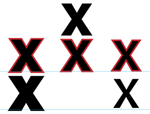
The lower-left sample has been stroked on the outside with black, making the character appear bolder. The lower-right sample has been stroked on the inside with white, making the character appear thinner. The blue lines indicate the characters’ original baselines.
Animate the line
InDesign also lets you skew characters to give them a fake italic or oblique slant. Using a negative value (add a hyphen before your numeric value) creates what’s called a backslant. Again, the light touch is the right touch—the variation you’re after is that which you’d find in the range of normal informal hand lettering.
Rotating individual characters also helps animate the line and knock some of the stiffness out of the setting. We did this to the two “l’s” in the word “All,” with the first “l” leaning to the left and the second to the right. Alas, InDesign can’t rotate individual characters—you have to convert them to outlines first. Illustrator can perform this trick, however, from within the Character panel.
Even in a whacky setting like this, spacing is crucial, and you’ll notice our sample is heavily kerned. That’s because characters that have been converted to outlines lose their side bearings, so they need to be kerned to loosen up their spacing. Happily, when it comes to kerning, neither InDesign nor Illustrator distinguishes between normal characters and those that have been converted to outlines.
A word of warning
All of the above shenanigans are best performed on informal faces, such as those that mimic handwriting (for example, Tekton or Comic Sans) or brush-painted letters (such as Dom Casual, or Flash). Avoid using these techniques with script faces that have connecting letters because variations in stroke weight will seem out of place. And by all means, don’t apply them to text faces, because the result will make a big mess, and I refuse to be held responsible. Here’s our finished type in a poster
 CREDIT: ©ISTOCKPHOTO/JAMES THEW

