The Art of Type: Ligatures: Fusion Power
It’s up to ligatures to restore peace and harmony.
Good typography comes from paying attention to scads of tiny details, the glorious whole being the noticeable consequence of many seemingly inconsequential actions. The tiny detail under the lens this issue is the ligature, a single glyph created from the fusion of two or more letterforms. These “weddings” are usually performed to head off the unattractive collision of adjoining characters. It’s up to ligatures to restore peace and harmony.
The pesky f hook
Most ligatures involve the lower case f, with its pesky hook, which has the habit of overlapping ascending characters to its right. The theory behind ligatures is that if these characters are going to overlap anyway, they may as well be designed to overlap aesthetically, by creating the f and its neighbor as a single glyph. The most common two-character ligatures are fi, ff, and fl. Common three-character ligatures include ffi and ffl.
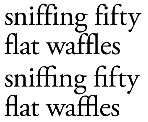
Set in Adobe Garamond Pro with no ligatures (top)—the is look like water drops hanging off the f hooks; (bottom) Standard fi and fl ligatures as well as the OpenType discretionary ffi and ffl ligatures.
Although sans serif faces contain at least some of these ligatures (they’re part of the standard glyph set for most fonts), by tradition they’re rarely fused together visually as they are in serif faces. Rare exceptions include Matthew Carter’s Verdana (which has fused fi and fl forms) and Erik Gill’s Gill Sans (only fi).
Of the Adobe CS3 applications, InDesign has the best support for ligatures, as it can automatically insert ligatures from any font that contains them (most have at least fi and fl). To do this for PostScript Type 1 and TrueType fonts, simply select Ligatures from the Character panel flyout menu. To get InDesign to insert ligatures from OpenType fonts, choose OpenType from the Character panel flyout menu and select Discretionary Ligatures from the submenu.
Photoshop and Illustrator can only insert ligatures from OpenType fonts. In Photoshop, choose OpenType from the Character panel flyout menu, then Standard Ligatures from the submenu. In Illustrator, turn on ligature insertion from the Window>Type>OpenType panel (Shift-Option-Command-T [PC: Shift-Alt-Ctrl-T]). In general, you want to have automatic ligature insertion turned on at all times.
Smart ligatures
Although these compound characters are represented by a single glyph, Adobe programs cleverly keep in “mind” that they represent separate letters. So, when the word “waffle” appears near the end of a line, InDesign is smart enough to remove the ligature and hyphenate the word properly: waf-fle.
The same thing occurs when character spacing is altered. For instance, if you open up the tracking of a text passage containing ligatures, InDesign will drop the ligatures in favor of their constituent characters and open their spacing accordingly. The same thing happens when tracking is tightened, because otherwise the fixed spacing between the component elements of the ligature would stand out in contrast to the spacing of their neighbors. Ditto for justified type, where spacing has to be stretched or squeezed to fit type into fully filled lines. When a certain, rather small, spacing threshold has been crossed, InDesign will revert to handling the ligatures’ constituent parts as independent characters. Hand kerning can also cause ligatures to disappear.
You can’t assume that this automation always assures perfect results. Clearly, if your type program can break ligatures to justify type, you won’t have consistent ligature use throughout your text. This isn’t necessarily a bad thing, as aesthetic spacing is more important than consistent glyph selection.
A key exception is when justification or tight tracking causes adjoining characters to collide (loose spacing isn’t a problem). It’s most likely with the fi combination, as the “ear” at the end of the f’ s hook overlaps the dot of the i, making a noticeable dark knot in the text. And it’s one reason why some typographers—especially those who come from a tradition of metal, handset type—frown on squeezing character spacing to justify type. The fastidious should look (with the help of their trusty proofreaders) for cases in which ligatures should be restored where the program has removed them. The fix: Select both letters and open the tracking of the letter pair until the ligature reappears.
Ugly display
The bigger problem is in display type, even in sublines at sizes down to, say, 14-point. At this size, the inconsistent use of ligatures (now you see them, now you don’t) in a passage of type can become obvious. In these cases, make an effort—by manipulating kerning and/or tracking—to force the use of ligatures throughout (the preferable alternative) or eliminate the appearance of ligatures altogether.
Worse, though, are ligature problems in large type, such as titles and headlines. Tight tracking in headline type is the norm these days, often carried to extremes. When it comes to ligature situations, you can get away with tight spacing when using sans serif faces, primarily because the hook of a sans serif f tends to be narrower than in a serif face, so it’s not as likely to overlap an ascending character to its right—not so with most serif faces.
Unintentional ligatures—collisions between characters—are ugly in display type. Assuming that the troubling sequence of characters is unavoidable, the best solution is to use ligatures and adjust the rest of the type’s tracking to match the ligatures’ spacing as well as possible. Where house style mandates tight headline spacing, this may mean that the spacing of the ligature elements will look a little too loose. But this is better than having the ligature break up and its constituent parts engage in an unseemly “wrestling match.” When tight tracking is the order of the day, use manual kerning to open up the spacing of the would-be ligature characters until your program restores the ligature.
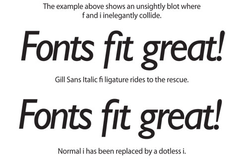
The dotless i
If tracking is so tight that the ligature’s internal spacing is distractingly loose, there’s one other alternative (editors willing): the dotless i ( ı ). This obscure character is included in nearly all fonts, principally as a building block for accented characters (ì, í, î, ï), but it can be used in display type when overbearing fs insist on mugging the dots of the is that follow them. This is most commonly done in ad type (where it’s normal to play fast and loose with the rules of composition and usage), but even in serious work, it’s occasionally just the right tool for the job.
On the Mac, the dotless i can be typed simply by pressing Shift-Option-B. On the PC, it’s more complicated: Open Character Map, check off Advanced View, and with Character Set set for Unicode, type 0131 (the Unicode ID number for the dotless i) in the Go to Unicode field. The dotless i will be highlighted in the character grid, and you can use the Copy button and your program’s Paste command to get it into your text. In any Adobe program’s Glyph panel—which has no search tools—you have to browse visually for this (and any other) glyph—something that really needs fixing.