Going to Press
In each issue of Layers magazine I’ve focused on helping you learn new ways of using InDesign to lay out your pages. Now it’s time to take a look at getting all that beautiful layout work you’ve done to press. Although the title of this tutorial is “Going to Press,” these tips are aimed at outputting your InDesign work properly no matter what your actual printing process—even if all you do is make a PDF and put it on the Web.
1 [OPEN CURRENT INDESIGN PROJECT]
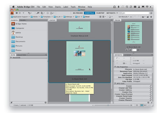
To get the most out of this tutorial, you’re going to need a document open with some text and images on the page. If you’re brand-new and don’t have one, you can either create one from scratch or use one of the built-in templates by choosing Create New From Template on the Welcome screen. This will launch Adobe Bridge where you can choose your template.
2 [OPEN NEW PREFLIGHT PANEL]
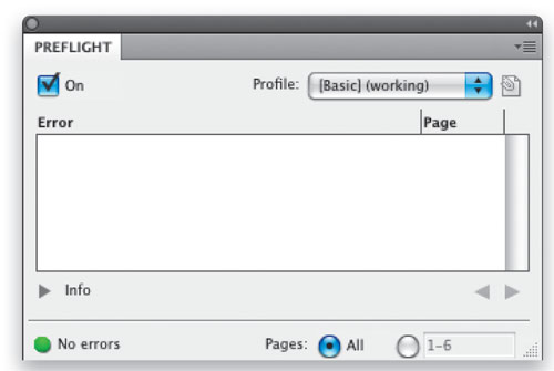
In InDesign CS4 you can take advantage of active Preflight, which will monitor your document constantly to make sure that it adheres to your preferences/constraints. Bring up the Preflight panel from the Window>Output menu.
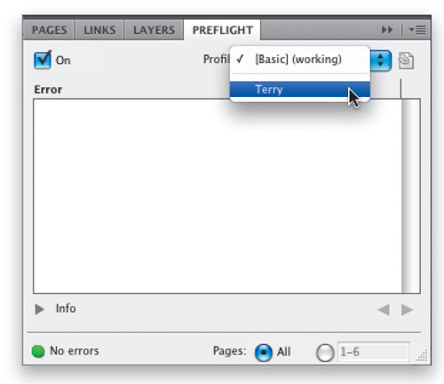
3 [DEFINE CUSTOM PREFLIGHT PROFILE]
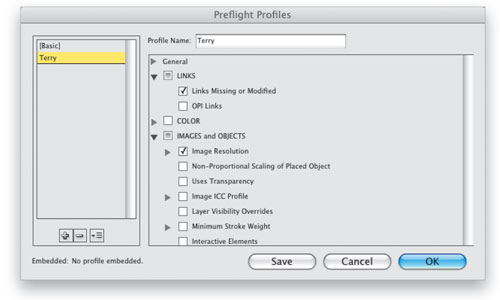
Choose Define Profiles from the Preflight panel’s flyout menu. By default, you have a Basic profile that can’t be modified. Click the + icon at the bottom of the panel to define a New Preflight Profile. Give it a name and then choose which options you’d like the active profile to monitor. You can choose things such as: missing links, minimum image resolution, missing fonts, overset text, etc. Once you’ve defined your criteria, click OK.
4 [ASSIGN PREFLIGHT PROFILE TO DOCUMENT]
Now that you have your preflight profile defined, you actually have to assign it to your document. So choose your newly defined preflight profile from the Profile pop-up list in the Preflight panel.
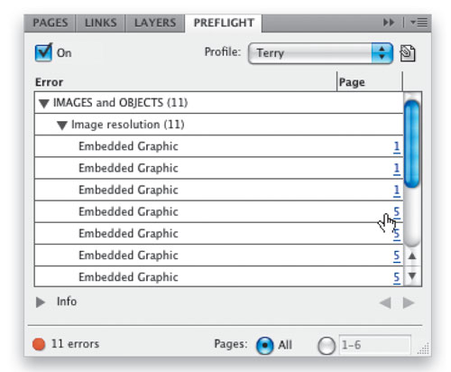
5 [FIX PREFLIGHT ERRORS]
At this point, you’ll either have a green or red error light depending on what you defined in your profile and what’s in your document. When I chose my profile, I got a red error light (dot) with 11 errors because I defined my profile to have a minimum image resolution. The template contains 11 low-res images, so they’ll need to be replaced to meet my profile standards. There’s a hyperlink next to each error that also specifies the page where the error takes place. This will allow you to jump right to the item in question and fix it.
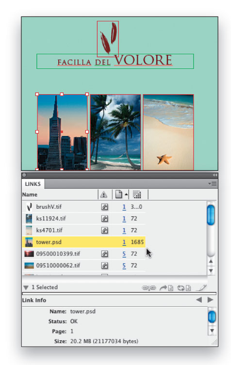
6 [SIZE PHOTOS IN PHOTOSHOP]
When you place an image, InDesign lets you size the image to fit your frame size. Although this is a nice feature, it’s not the optimal solution for printing. For example, let’s say you place a high-res (300 ppi), 8×10″ image in a frame, but then downsize it to fit 1.2×1.78″. The Effective PPI jumps to 1,685. Therefore, it’s best to size your image to the final size in Photoshop and bring it in at actual size. Note: If you can’t see this column in your Links panel, choose Panel Options from the flyout menu and check the Show Column box beside Effective PPI.
7 [RGB OR CMYK?]
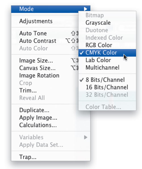
Before you bring that image into InDesign from Photoshop, you should ascertain if RGB is okay. Only your printing provider can answer that question. RGB has a much larger gamut of colors but CMYK is the standard for offset printing. Some of the newer digital presses can handle RGB workflows but you’ll have to ask to know for sure. To convert to CMYK, open your image in Photoshop from InDesign by selecting the image and using the Edit>Edit With>Adobe Photoshop CS4, then choose Image>Mode>CYMK Color in Photoshop to convert it. Save and Close the image to update the link in InDesign.
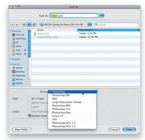
8 [SAVE AS PSD OR TIFF]
Although InDesign can accept a variety of different image formats, if you’re going to high-res professional output, then you should save your photos as either PSD or TIFF files. Why not JPEG? Because JPEG is a compressed format and takes longer to print, as it has to decompress on-the-fly for printing. So, to make your provider happier, use either PSD or TIFF files.
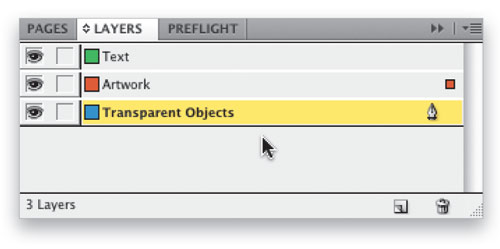
9 [CHECK TRANSPARENCY STACKING ORDER]
InDesign lets you use transparency right in the application without having to go back to Photoshop or Illustrator; however, depending on how you stack things, you could create printing headaches. The rule is: Always keep your nontransparent objects and vector text/line art on top. An easy way to do this is to use layers and assign each kind of object to the appropriate layer.
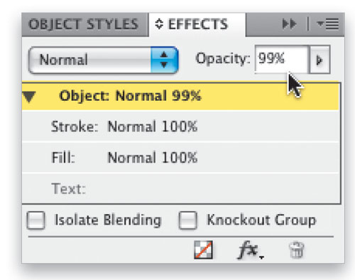
10 [COMMON TRANSPARENCY ISSUE]
Even when you follow the rules, you can still have problems. Say you put a transparent object on top of a nontransparent image. For example, when you put a drop shadow on your text and then put your text on top of a photo, sometimes this yields a box or outline around the object. The problem arises because some printing RIPs don’t process the transparent object properly on top of the nontransparent object. So try this: Select the object(s) and set it to 99% Opacity in the Effects panel. This makes no visible change, but will force it to go through the Transparency Flattener with the object on top.
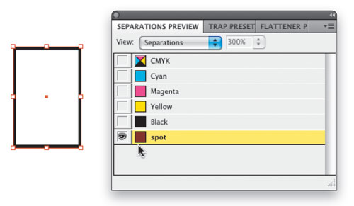
11 [CHECK SEPARATIONS PREVIEW]
Next, you want to check how many plates your job will yield. If it’s a four-color job, then chances are you want only Cyan, Magenta, Yellow, and Black plates. Having too many plates may cause delays in your print job while the file is fixed. Choose Window>Output>Separations Preview to show the number of plates in your job. If you have more than you should, you need to locate the object generating the extra color and change it. An easy way to do this is to hide (turn off the Eye icons) all the plates except the extra one (make sure the view pop-up list is set to Separations).
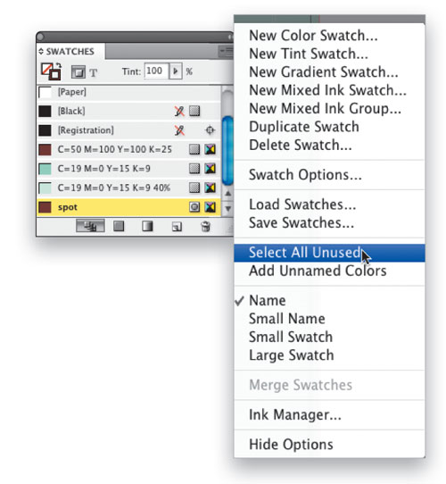
12 [USE SWATCHES; ELIMINATE UNUSED ONES]
If you’re using color in InDesign, then you should definitely be using Swatches, which allow you to keep consistent colors. You can also change all objects using a specific color by changing the Swatch. If you’ve created Swatches that you didn’t end up using, however, it’s best to remove them to reduce confusion. Just choose Select All Unused from the Swatches panel’s flyout menu, which selects any swatches that didn’t get used in the job, then just click the Trash icon at the bottom of the Swatches panel to remove them.
13 [PACKAGE IT UP]
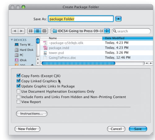
You should now be ready to send your InDesign file to the printer. You’ll need all the linked graphics and, to make sure the print provider has the right fonts, send those too. Luckily, InDesign has a Package feature (File>Package) that puts a copy of your saved document, all the links, and the fonts in a folder of your choice. By default, it will run a Preflight first. Just click the Package button to continue. Fill out the Printing Instructions and click Continue. Now specify where to save the files and InDesign will create a new folder that contains everything the printer needs.
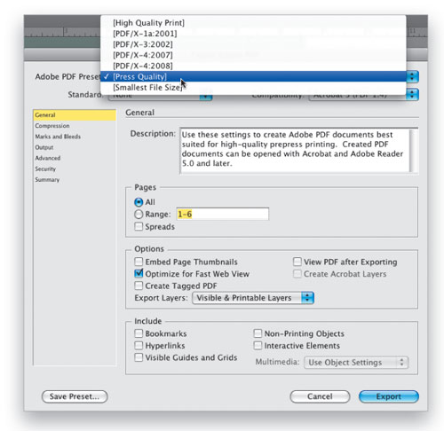
14 [EXPORT A PDF]
Although your service provider can print your InDesign file (provided they have the same InDesign version as you do), sometimes it’s easier and safer to send a PDF instead. Even if you’re sending the original InDesign file, it’s still a good idea to send a PDF. To create a PDF, choose File>Export, make sure that the Format is Adobe PDF, and click Save. In the dialog, choose the appropriate PDF Preset for the kind of printing you’re doing (ours is Press Quality), then click Export to generate your PDF.