
Before & After: What's the Right Typeface for Text?

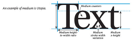
 Text type is more common than any other. Text makes up the acres of gray in books, magazines, reports, and hundreds of other documents. When reading is the primary goal, it’s the designer’s job to ensure that the text is smooth, flowing, and pleasant to read. The hallmarks of good text type are legibility and readability. Legibility refers to clarity; it’s how readily one letter can be distinguished from all others. Readability refers to how well letters interact to compose words, sentences, and paragraphs. When evaluating the choices, the operative word is medium.
Character Widths
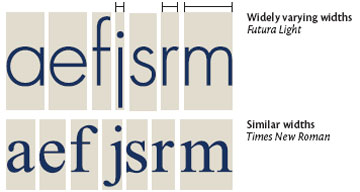 Pick a typeface with similar character widths
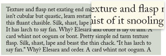
For the smoothest appearance, an alphabet’s characters should have similar widths. Reading has a natural rhythm; an alphabet such as Futura with widely varying character widths disrupts it.
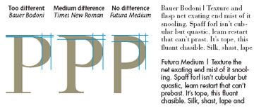
Height-to-Width Ratio
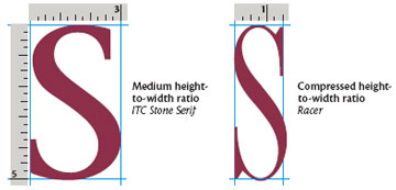 Medium height-to-width ratio
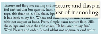
We identify letters by their physical characteristics–stems, bars, loops, curves, and so on; the clearer they are the more legible the letter. As letters are compressed (or expanded), these features get distorted–diagonal strokes, for example, become quite vertical–and so are harder to identify.
X-height
Medium x-height
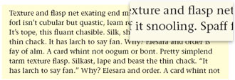
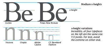 The x-height of a typestyle is the height of its lowercase characters. The larger the x-height, the denser the type will appear. You want medium; unusually tall or short x-heights are better suited for specialty projects.
Stroke Weight
 Look for small variations in stroke weight
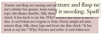
The best text faces have stroke weights that vary somewhat, which make converging lines that help the eye flow smoothly. But avoid extremes. Modern styles (left) vary too much; at high resolution their beautiful, superthin strokes disappear in a dazzle. Sleek geometric styles (far right) vary little or not at all, so are too uniform.
Mirrors
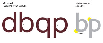 Watch out for mirrors
Geometric typestyles are so uniform that their letters are often mirror images. For text, this isn’t ideal–the more distinct each letter is, the more legible whole words will be. Look for typestyles that don’t mirror.
Counters
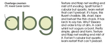 Avoid overlarge counters
Counters are the enclosed spaces inside letters. Avoid typestyles whose counters are very large in relation to the stroke weight. In the case of Avant Garde (right), note how much greater the space inside the letters is than the space outside. This will slow the reader. Set in text (far right), Avant Garde looks like Swiss cheese!
Type Quirks
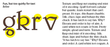 Avoid quirkiness
Typographic sprites are fun to look at and great for heads, but in text they wear out their welcome fast. Why? The extra swashiness gives the eye too much to follow and is very tiring.
Favorite Text Faces
While many typefaces meet the requirements of legibility, readability, and beauty, the following four are the ones we turn to most often:
 Adobe Caslon (11/12.75 pt)
First choice for books, Caslon may be the Roman alphabet’s most readable typeface. Its letters aren’t beau tiful, but strung into sentences and paragraphs they have fit, texture, bite, and can be read comfortably for hours. Caslon will withstand even the tightest leading.
 Adobe Garamond (11.5/12.75 pt)
If we could have only one typeface, this would be it; Garamond is easy to read and elegant, too. A little on the dressy side, Garamond is a fine display face– rare in this class–and as a result can carry a document all by itself. Gara mond sets small; set text in 10-point minimum with about 10% extra leading.
 ITC Stone Serif (9.5/12.75 pt)
Stone is boring to look at bit buttery to read. Characterized by its stub by, lower case r that tucks snugly to its neighbors, Stone is designed for outstanding fit. It sets large; 9-point is as big as you should go. Use at least 35% extra leading.
 Janson Text 55 Roman (10.5/12.75 pt)
Janson holds the middle ground between the earthy, work manlike nature of Caslon and the high classiness of Garamond. Rounder and denser, it has a chiseled, resoslute appearance. Janson sets about average size; give it about 20% extra leading.
![]() John McWade is a designer, teacher, and author who has been at the forefront of the graphic design and desktop publishing worlds for two decades. He is founder, publisher, and primary voice of Before & After magazine (www.bamagazine.com; email: layers@bamagazine.com).
John McWade is a designer, teacher, and author who has been at the forefront of the graphic design and desktop publishing worlds for two decades. He is founder, publisher, and primary voice of Before & After magazine (www.bamagazine.com; email: layers@bamagazine.com).
